Responsive Web · Mobile App · 2023 - 2026
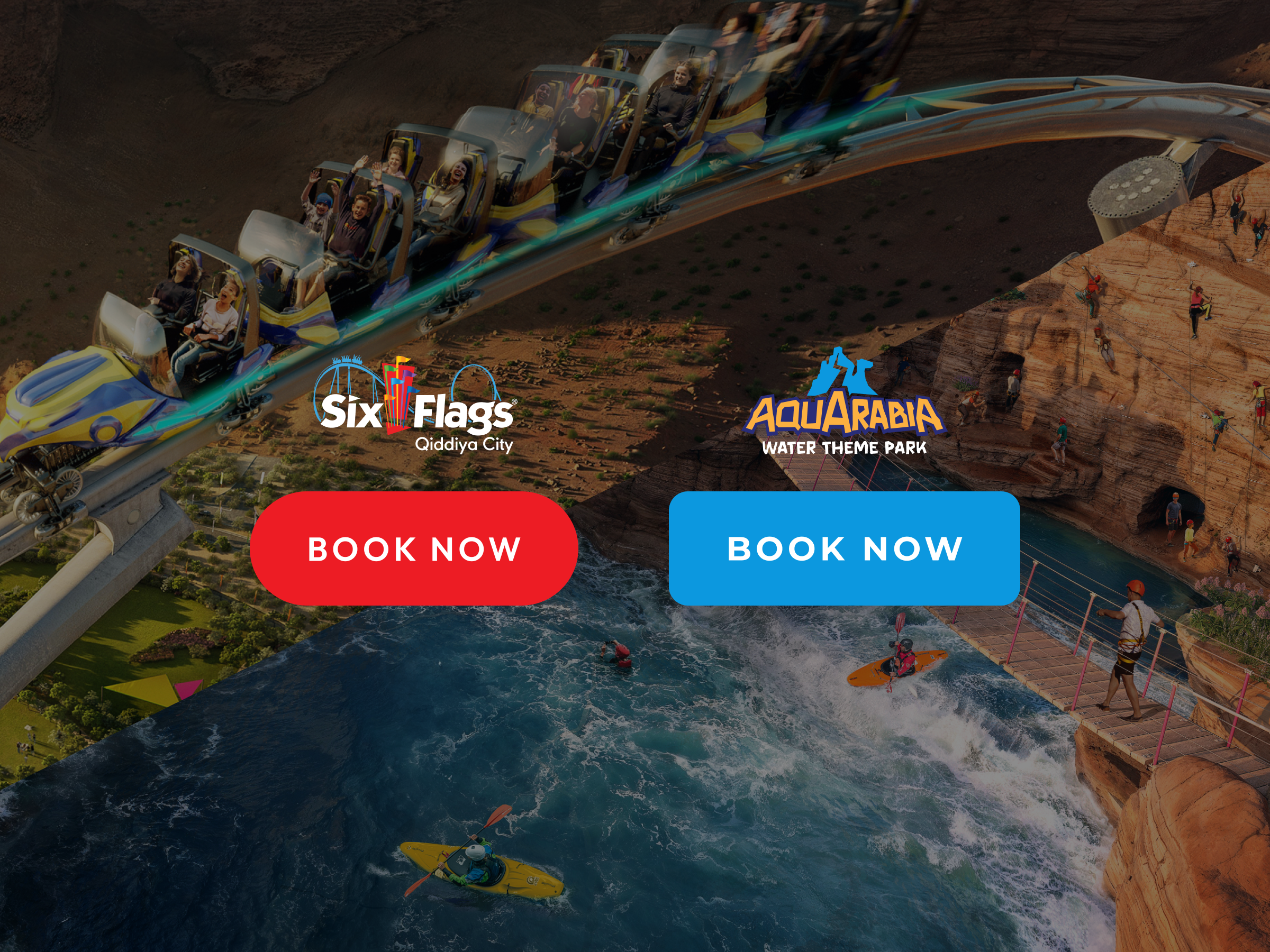
Aquarabia
Designing the digital platform for Qiddiya's flagship water park while the brand itself was still being defined.
Defining the platform while the brand itself was still taking shape.
Impact
- Defined the digital identity of Aquarabia ahead of physical launch
- Influenced visual language, components, and interaction patterns across the platform
- Delivered a scalable system reused across Qiddiya's ecosystem

Aquarabia's digital platform began before the park's identity was fully defined.
Unlike Six Flags, the challenge was not only to introduce a destination, but to help shape what it would become. The park's zones, experiences, and visual language were still evolving, and the platform had to translate that ambiguity into something coherent and compelling.
To support this, we designed a flexible system that could adapt to changing brand inputs while maintaining consistency as both the platform and identity matured.
Business Goals
- Introduce Aquarabia as a flagship entertainment destination within Qiddiya City
- Build early awareness before the park opened
- Showcase rides, water attractions, and experiences
- Establish a digital identity that aligned with the evolving brand
- Capture early interest and anticipation ahead of launch
User Goals
- Understand what Aquarabia is and what makes it unique
- Explore rides, experiences, and park zones
- Stay updated on the park as construction progresses
Design Challenge
"How might we design a compelling digital experience for a destination that does not yet exist while helping define the visual language of the brand itself?"
- Led UI design across major parts of the responsive website and mobile app, translating the emerging Aquarabia identity into scalable interface patterns, transitions, and components
- Influenced early brand exploration, particularly in color choices, visual language, and overall look and feel as the Aquarabia brand began to take shape
- Led client presentations and project communication, presenting design work, facilitating feedback discussions, and guiding stakeholders through design decisions across multiple phases
- Adapted and extended the shared design system used across Qiddiya park platforms while ensuring Aquarabia developed its own distinct identity
- Supported responsive delivery across desktop, tablet, and mobile, including bilingual layouts for Arabic (RTL) and English (LTR)
- Led client communication and design direction across multiple phases, ensuring alignment as the brand evolved
As the project evolved through multiple releases, my role became increasingly senior, with greater ownership over design quality, system consistency, and how the platform expressed the Aquarabia brand digitally.
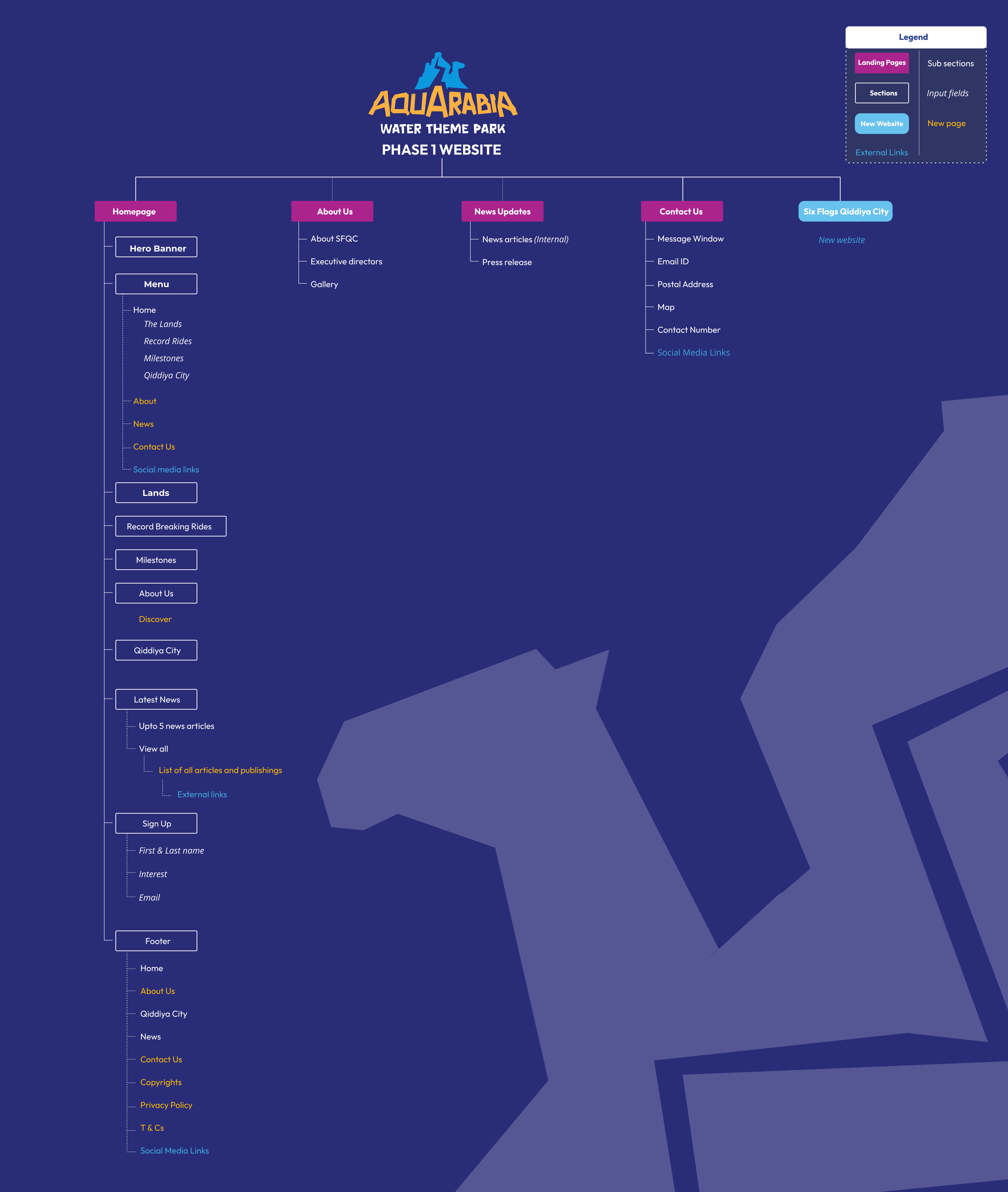
Undefined Brand Identity
When the project began there was no established Aquarabia brand system. The team only had early concepts for a water park experience. This meant design exploration helped influence elements that later became part of the brand.
Evolving Park Details
The park's attractions, zones, and experiences continued to evolve throughout development. The platform needed to accommodate new information across multiple releases.
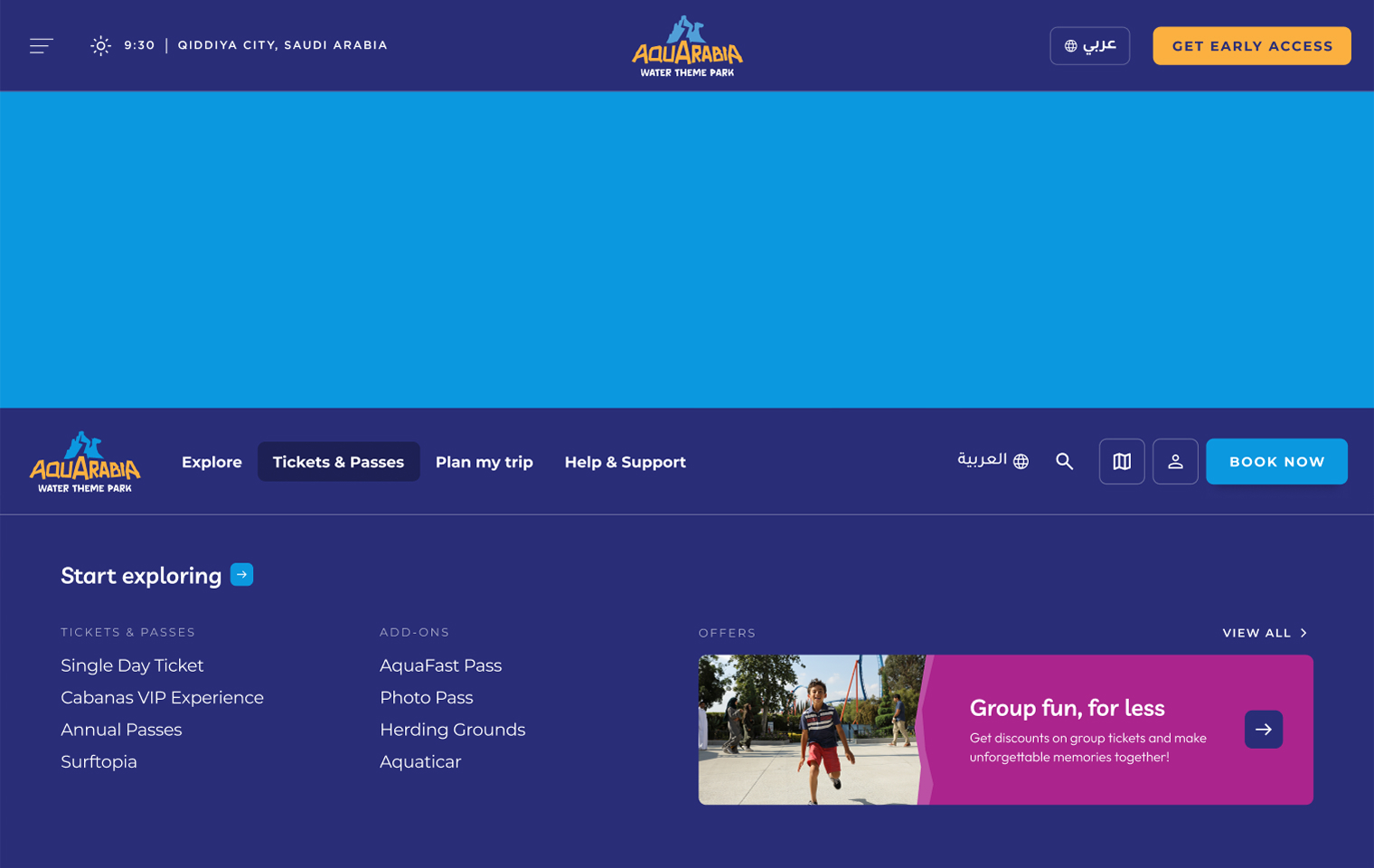
Bilingual Experience
The platform supported both Arabic (RTL) and English (LTR), requiring mirrored layouts and adaptable components.
Phased Platform Delivery
Like the Six Flags platform, Aquarabia needed to launch in phases before the park opened.
Shared System with SFQC
The platform reused elements from the Six Flags system but needed to maintain a unique identity to avoid the parks feeling identical.
This required a more flexible design approach, where the system could adapt to shifting brand inputs while still maintaining consistency across the platform.
Aquarabia started without a defined brand, the digital platform played a significant role in shaping the visual identity of the destination. The strategy focused on translating the emerging brand into a digital experience that felt playful, energetic, and connected to the natural environment of a water park.
This translated into a set of key design directions that shaped how the experience was expressed across the platform:
01
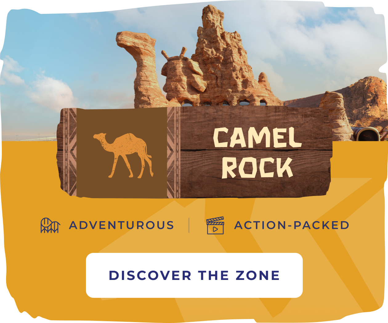
Showcasing zones as distinct identities
Aquarabia is organized into eight zones. Each zone has its own mascot, pattern, and color identity.
02
Deriving visual language from the brand
Design elements such as rocky shapes and fluid transitions were derived from the Aquarabia logo and environmental storytelling.
03
Designing for an evolving platform
The system needed to support the addition of new attractions and experiences as the park developed.
04
Highlighting experiences beyond rides
The platform highlights not only rides but also water-based activities such as surfing and kayaking.
Because the Aquarabia brand was still evolving, early design exploration helped shape parts of the visual identity. Rather than defining a fixed visual system, we created a flexible framework that could evolve alongside the brand as it matured.
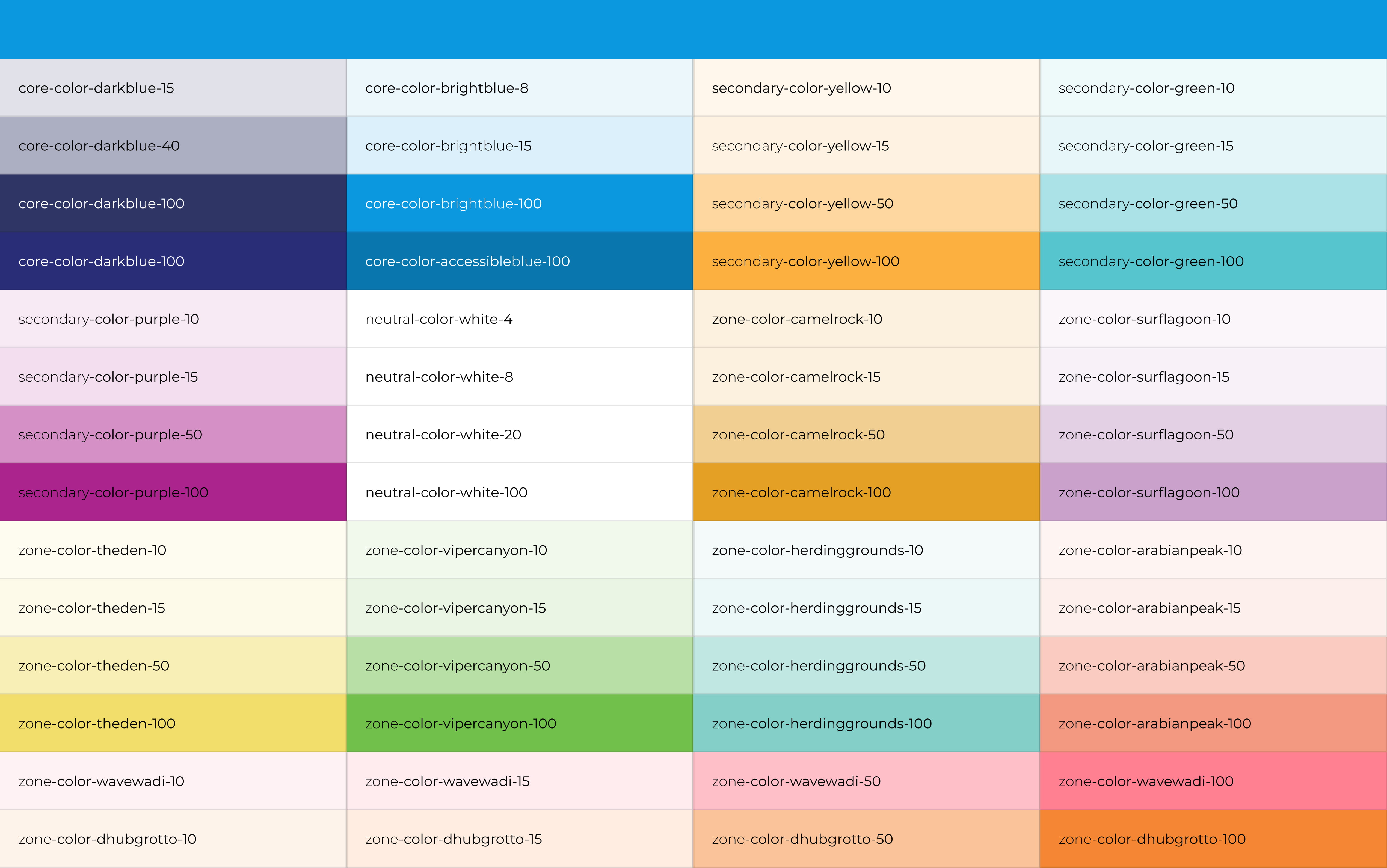
Color System
We explored multiple color directions during early concept work, some of which directly informed the final palette included in the brand guidelines.
Each zone within the park was assigned a distinct color, allowing the digital experience to visually differentiate between areas of the destination.
Visual Language
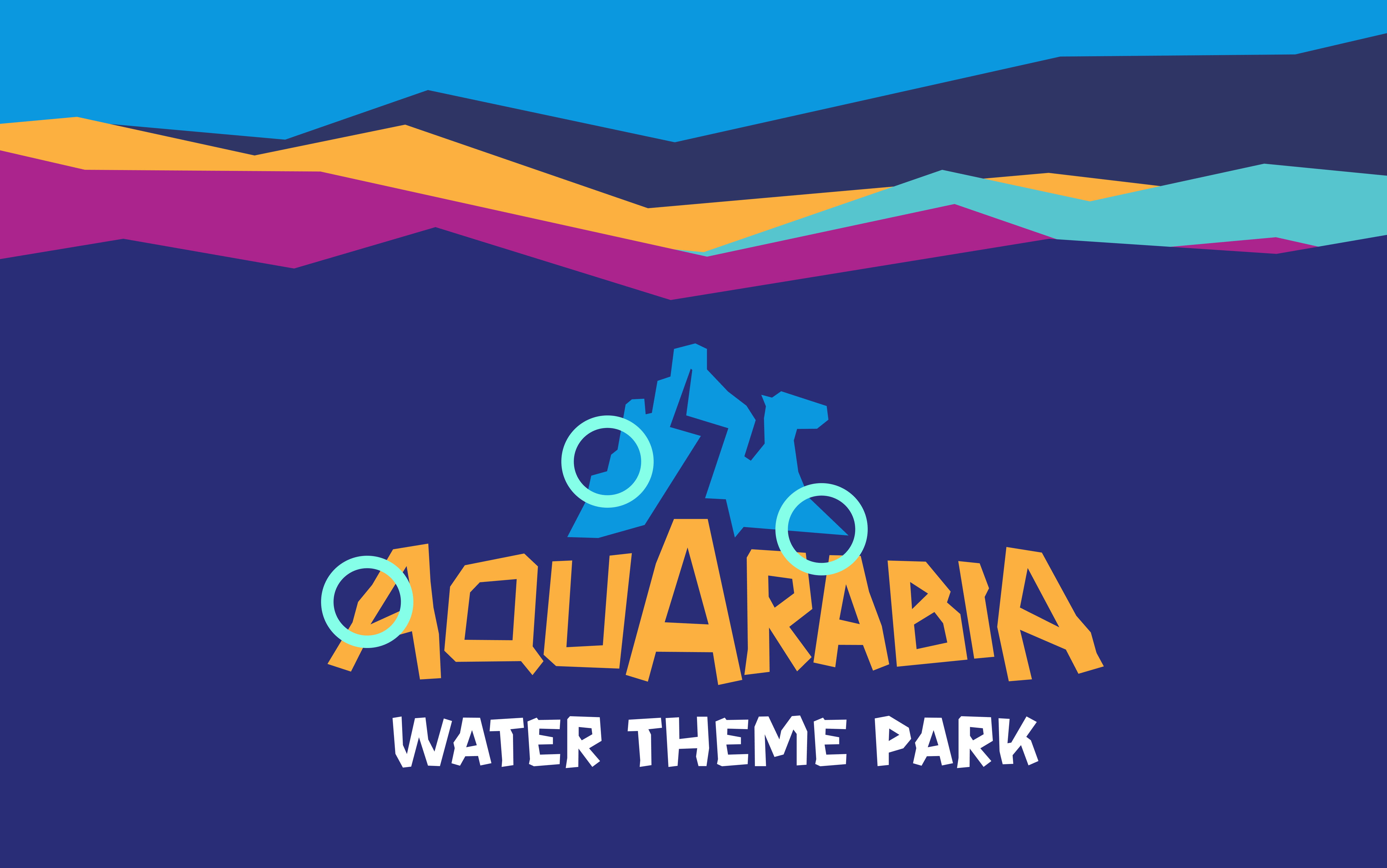
The Aquarabia logo includes rocky shapes referencing natural desert formations. These shapes inspired the section breakers and transitions used across the platform.
This created a consistent visual rhythm throughout the site while reinforcing the brand identity at every scroll point.
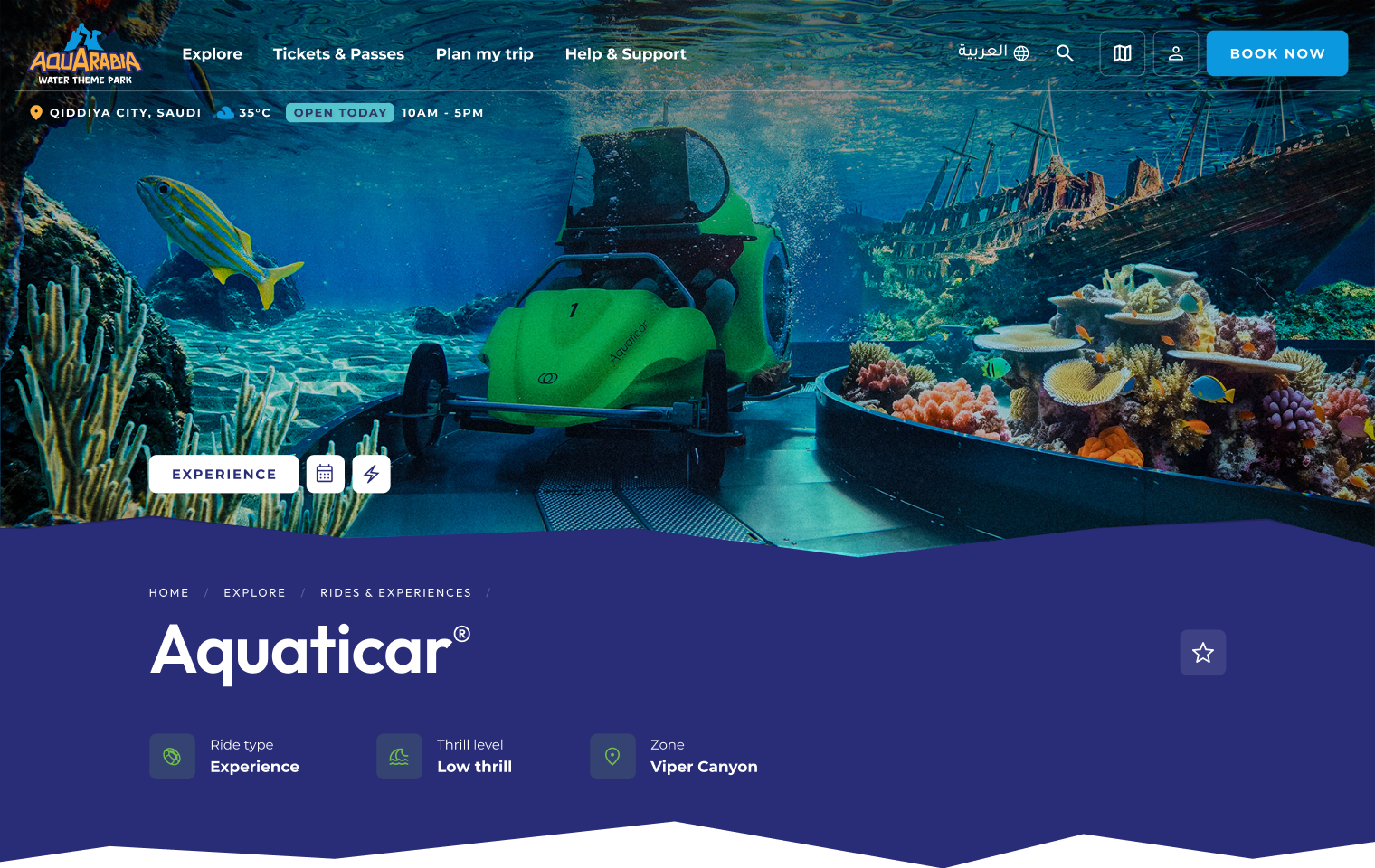
Component 01
Experiences & Record-Breaking Carousel
Problem
Users need to quickly understand the range of experiences available without having to navigate through multiple pages or dense content.
Solution
The carousel highlights record-breaking attractions alongside experiences such as surfing and kayaking.
Encouraging quick exploration and discovery by presenting a diverse range of offerings in a dynamic and easily digestible format.
Component 02
Milestones
Problem
Users need a simple way to understand the scale, uniqueness, and progression of the park without being overloaded with static information or long-form content.
Solution
The shape of the milestone elements was influenced by the Camel Rock icon from the Aquarabia logo, reinforcing the brand identity.
Communicating scale and uniqueness in a more engaging way, making key highlights memorable without overwhelming users with static information.
Component 03
Interactive Park Map
Problem
Users need a clear mental model of how the park is structured, including zones, offerings, and relationships between experiences, without relying on a complex or overwhelming map.
Solution
Users can explore the park by zone and filter attractions, dining, and shopping experiences.
Providing a clear mental model of the park, helping users understand structure and navigate offerings without relying on a complex map.
Interactions across the platform combine fluid motion with stronger geometric transitions inspired by the Aquarabia logo. Motion helps guide the user through the experience while reinforcing the themes of water and natural rock formations.
Continuity and Brand Expression
The platform used transitions to make large content shifts feel intentional and connected. Breakers inspired by the rocky forms of the Aquarabia logo were used between hero areas and major content sections.
In selected moments, these were softened with more fluid, wave-like transitions that reflected the water-based nature of the park. This helped maintain rhythm throughout the page while giving the experience a clear visual signature.
Motion as Hierarchy
Motion was also used to support hierarchy and focus. Subtle transitions drew attention to calls to action, interactive zones, filters, and content changes. This allowed the interface to feel lively without becoming distracting.
Because the platform introduced a large amount of evolving content, motion helped reveal information progressively and direct users toward the most important interactions on the page.
Responsive Interaction
The experience needed to work consistently across desktop, tablet, and mobile, in both Arabic and English.
This meant interactions had to adapt across screen sizes and input types. Hover-driven behaviors on desktop were translated into tap-based interactions on mobile, while transitions and navigation patterns were optimized for both LTR and RTL experiences.
Decision 01: Translating the Logo into a Digital Language
With no defined brand system at the start, the Aquarabia logo became the foundation for shaping the digital experience. The rocky geometry within the logo inspired the section breakers and transitions used across the platform.
These shapes helped establish a recognizable visual rhythm throughout the site. By translating the logo's forms into interface patterns, the platform developed a clear digital language while the broader brand identity was still evolving.
Decision 02: Differentiating Aquarabia from Six Flags
Although both parks shared parts of the same design system, Aquarabia needed its own identity. Six Flags leaned into darker tones and high contrast, while Aquarabia required a lighter, more playful atmosphere suited to a water park.
This influenced the palette, motion, and visual tone of the interface. Brighter colors, fluid transitions, and softer curves helped distinguish the platform while maintaining consistency with the broader Qiddiya ecosystem.
Decision 03: Expanding Discovery Beyond Rides
Unlike traditional theme parks, Aquarabia offers a wider range of water-based experiences including surfing, kayaking, and Aquaticar attractions. The platform needed to represent this variety rather than focusing only on rides.
Exploration components were therefore designed to highlight both rides and experiences together. This allowed visitors to quickly understand the range of activities available within the park.
Decision 04: Designing for an Evolving Destination
Aquarabia was still under development while the platform was being designed. Park details, zones, and attractions continued to evolve throughout the project.
To support this, the interface was built using modular components that could scale across phases. This allowed new content and experiences to be introduced without redesigning the platform.
Web + Mobile
Experience delivered across responsive website and mobile app
8 Zones
Park structure translated into a scalable digital experience
2023 – Ongoing
Platform designed and launched across multiple phases before park opening
- Established a distinct digital identity for Aquarabia while leveraging a shared system foundation, ensuring differentiation without duplication across Qiddiya's ecosystem.
- The Aquarabia platform launched ahead of the park opening and established the destination's digital presence before the physical experience existed
- Early design exploration helped influence parts of the visual identity, including color direction, transitions, and digital expression of the brand
- Although built from a shared foundation with Six Flags, the platform developed its own distinct look and feel rather than reading as a direct reskin
- The system continues to support new content, evolving park details, and future phases as Aquarabia moves closer to opening
01
Working on Aquarabia highlighted how digital design can influence an emerging brand.
02
Because the platform was developed before the brand was finalized, early design exploration played a role in shaping the visual language of the destination.
03
The project reinforced the importance of flexible systems, collaboration across teams, and designing products that can evolve alongside the destinations they represent.