Continuity and Brand Expression
Rock-shaped breakers between major sections, softened in places into wave-like transitions, make big content shifts feel connected and give the site a clear signature.
Responsive Web · Mobile App · 2023 - 2026
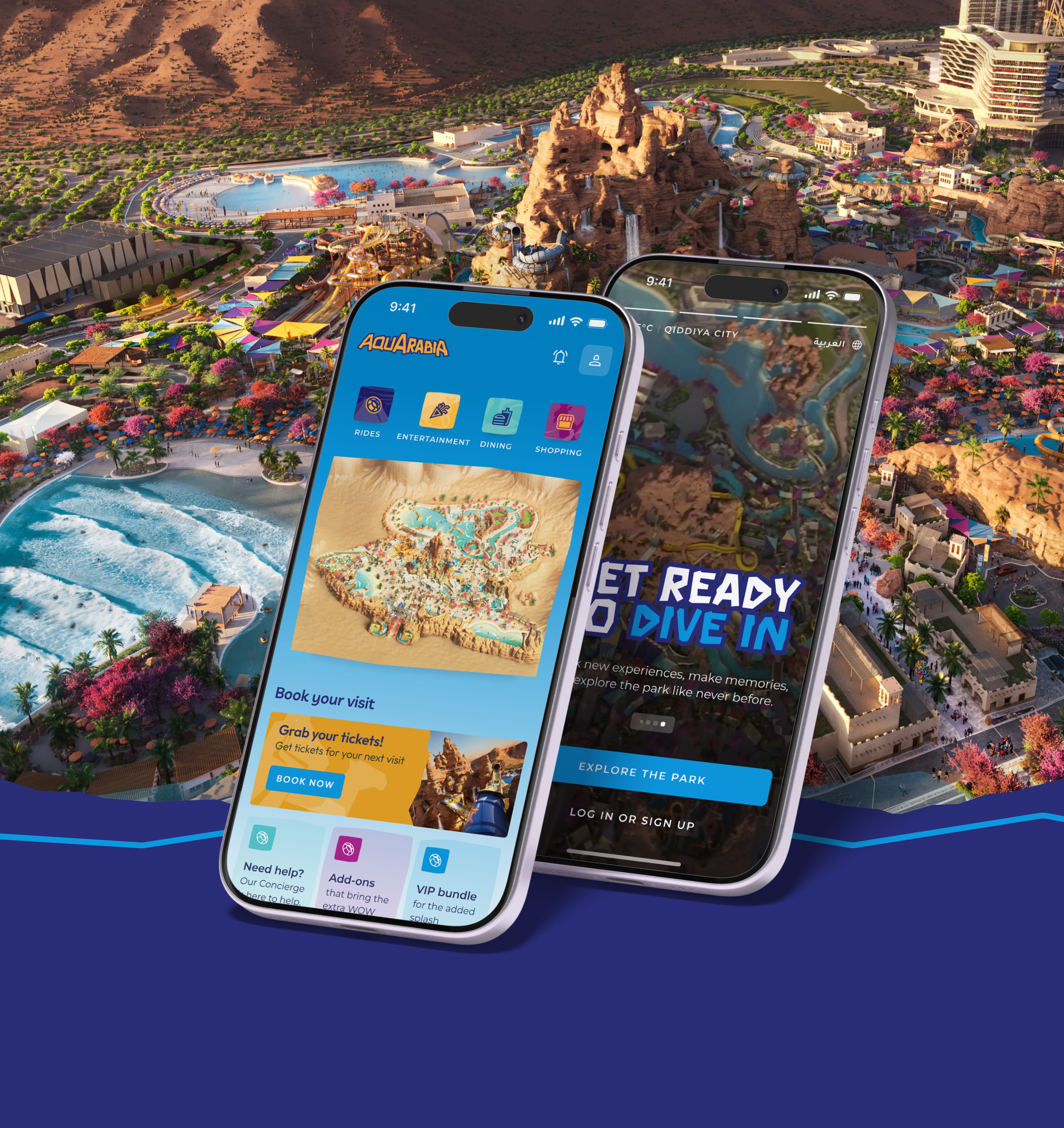
The digital platform for Qiddiya's flagship water park, designed while the brand itself was still being defined.
A platform that helped shape its own brand.
The challenge
The platform started before the park's identity was settled.
The approach
Translate an emerging brand into something playful, energetic and rooted in the water park's natural setting.
Impact
Business Goals
User Goals
Design Challenge
"How might we design a compelling experience for a destination that doesn't exist yet, while helping define the brand itself?"
My role grew more senior with each release, with more ownership of design quality, system consistency and how the brand came through digitally.
01
There was no brand system at the start, only early concepts, so design exploration helped shape what became the brand.
02
Attractions, zones and experiences kept changing, and the platform had to absorb them release by release.
03
Like Six Flags, Aquarabia launched in phases ahead of the park's opening.
04
Built on the Six Flags system, but it couldn't feel like the same park.
01
Eight zones, each with its own mascot, pattern and color.
02
Rocky shapes and fluid transitions drawn from the logo and the park's setting.
03
Room for new attractions and experiences as the park developed.
04
Surfing and kayaking alongside the rides.
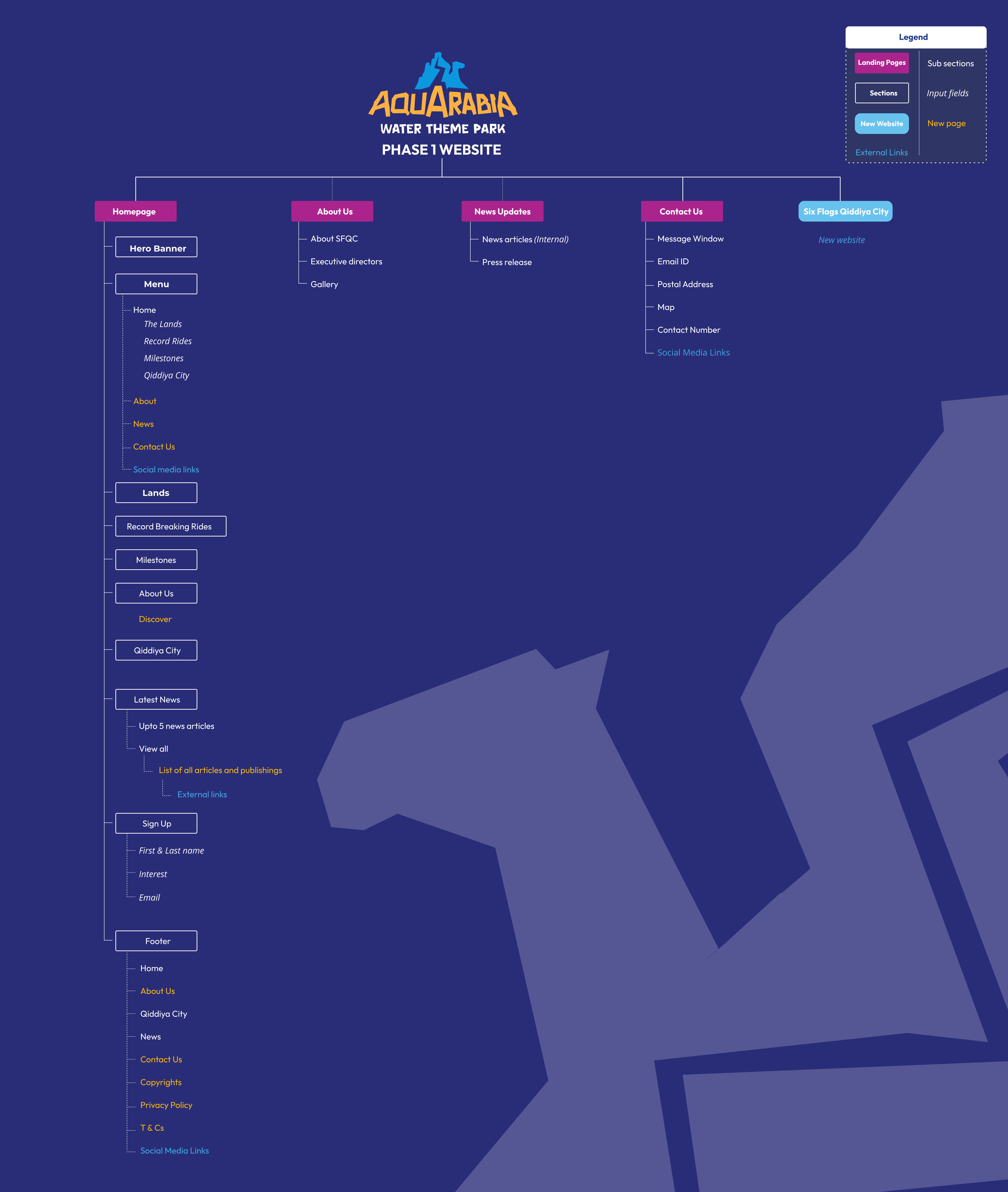
With the brand still forming, we built a flexible framework rather than a fixed visual system, so it could mature alongside the brand.
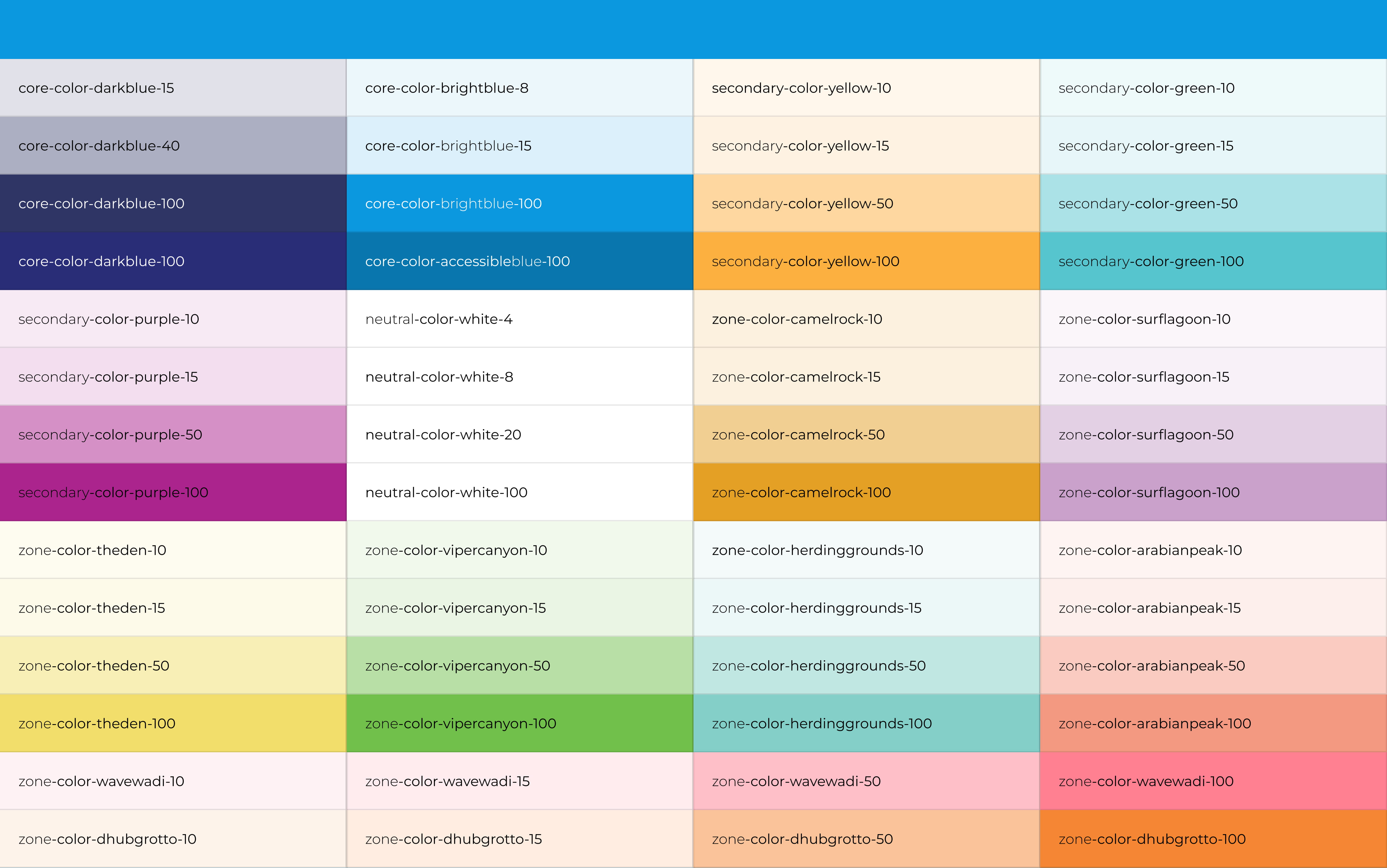
We explored several color directions early on, and some fed directly into the final brand palette. Each zone has its own color, so the platform can tell areas apart at a glance.
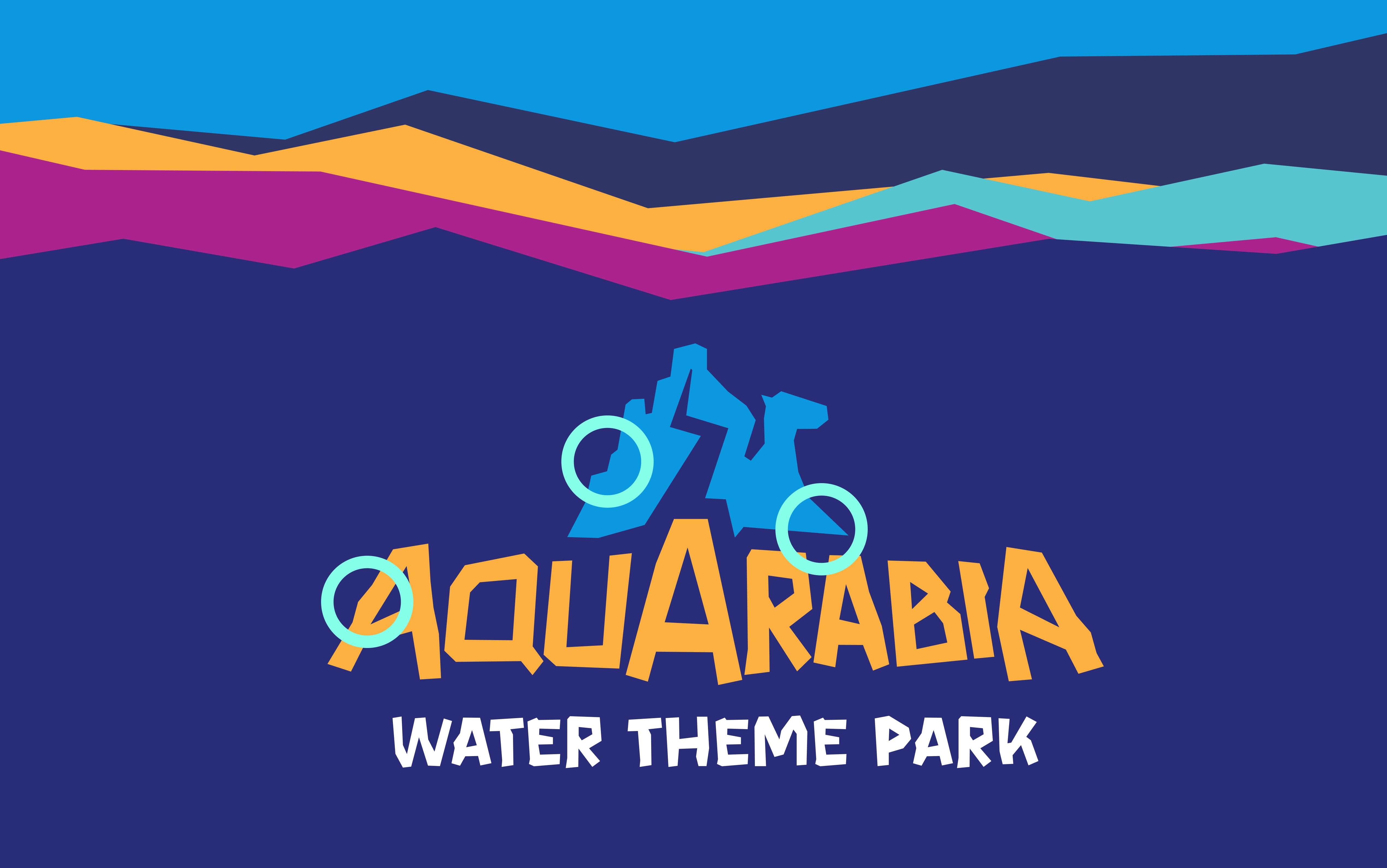
The logo's rocky shapes, drawn from desert rock formations, became the section breakers across the site, giving every scroll the same rhythm.
Rock-shaped breakers between major sections, softened in places into wave-like transitions, make big content shifts feel connected and give the site a clear signature.
Subtle motion draws attention to calls to action, filters and content changes, and reveals evolving content progressively. Lively, never distracting.
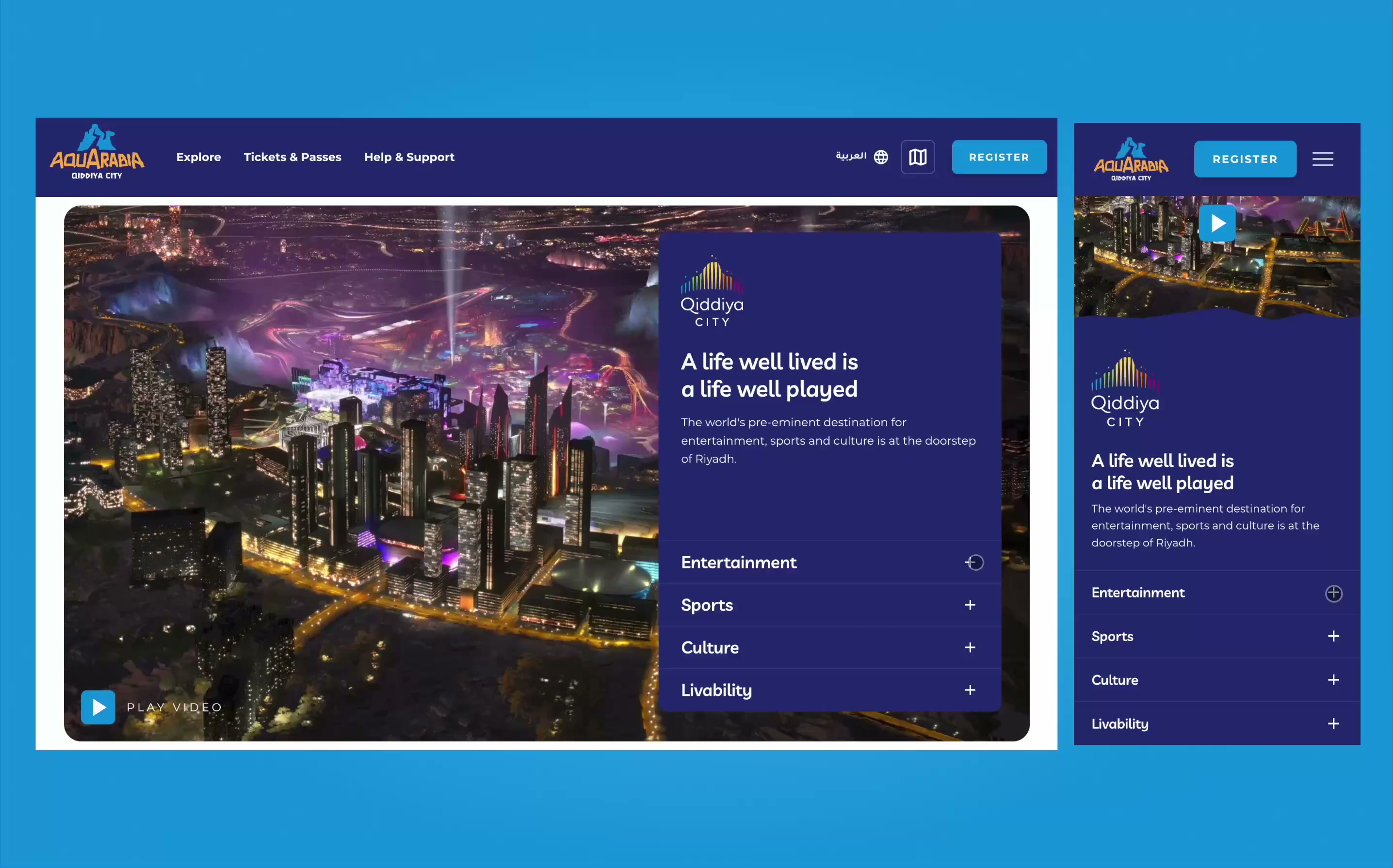
Consistent across desktop, tablet and mobile, in Arabic and English: hover becomes tap, and transitions and navigation work in both LTR and RTL.
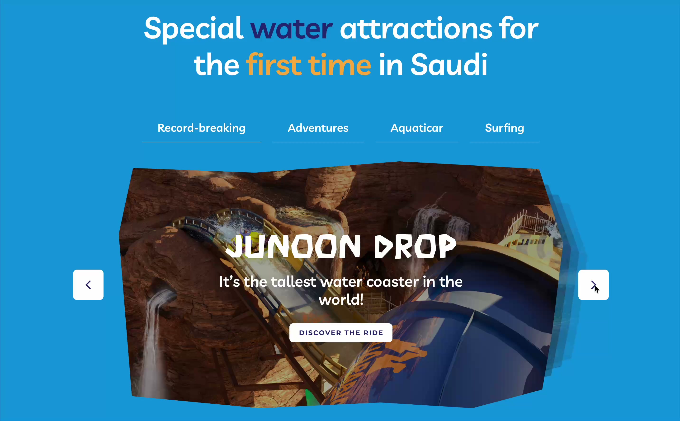
Component 01
Problem
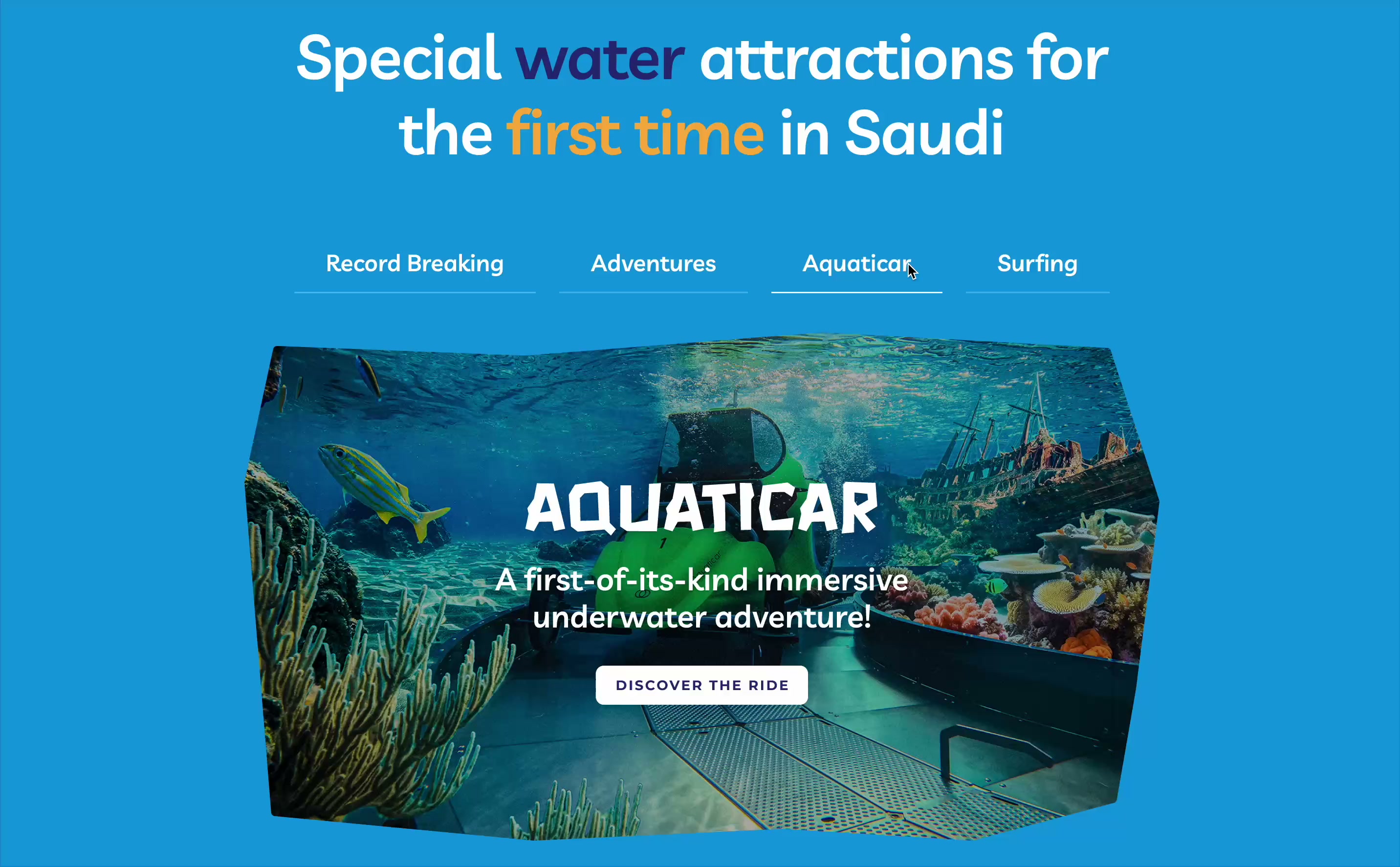
People needed a quick sense of everything on offer without digging through pages.
Solution
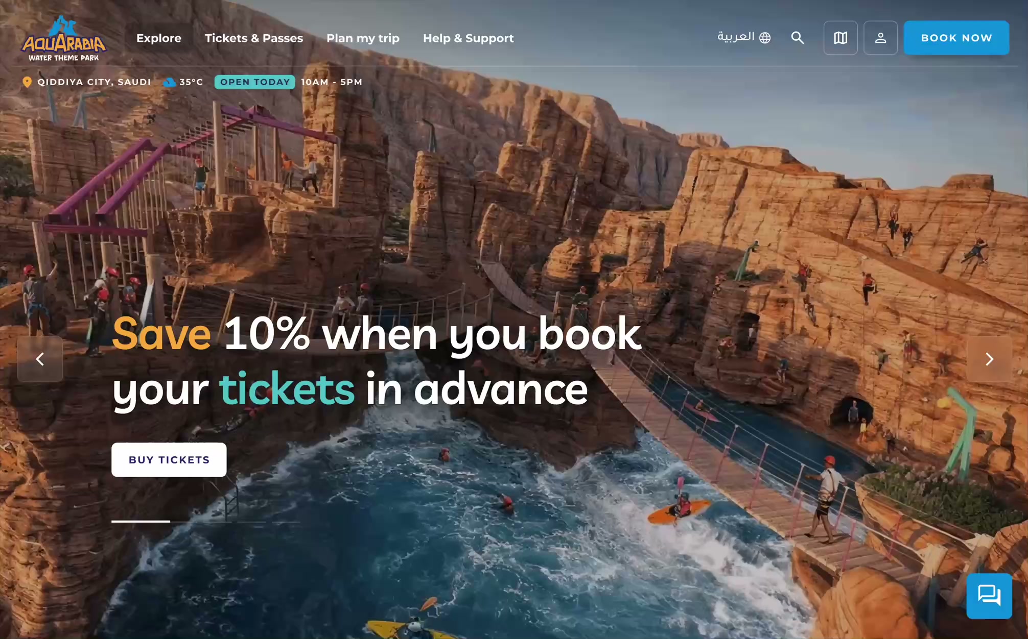
One carousel for record-breaking rides and experiences like surfing and kayaking, with video previews and animated stats.
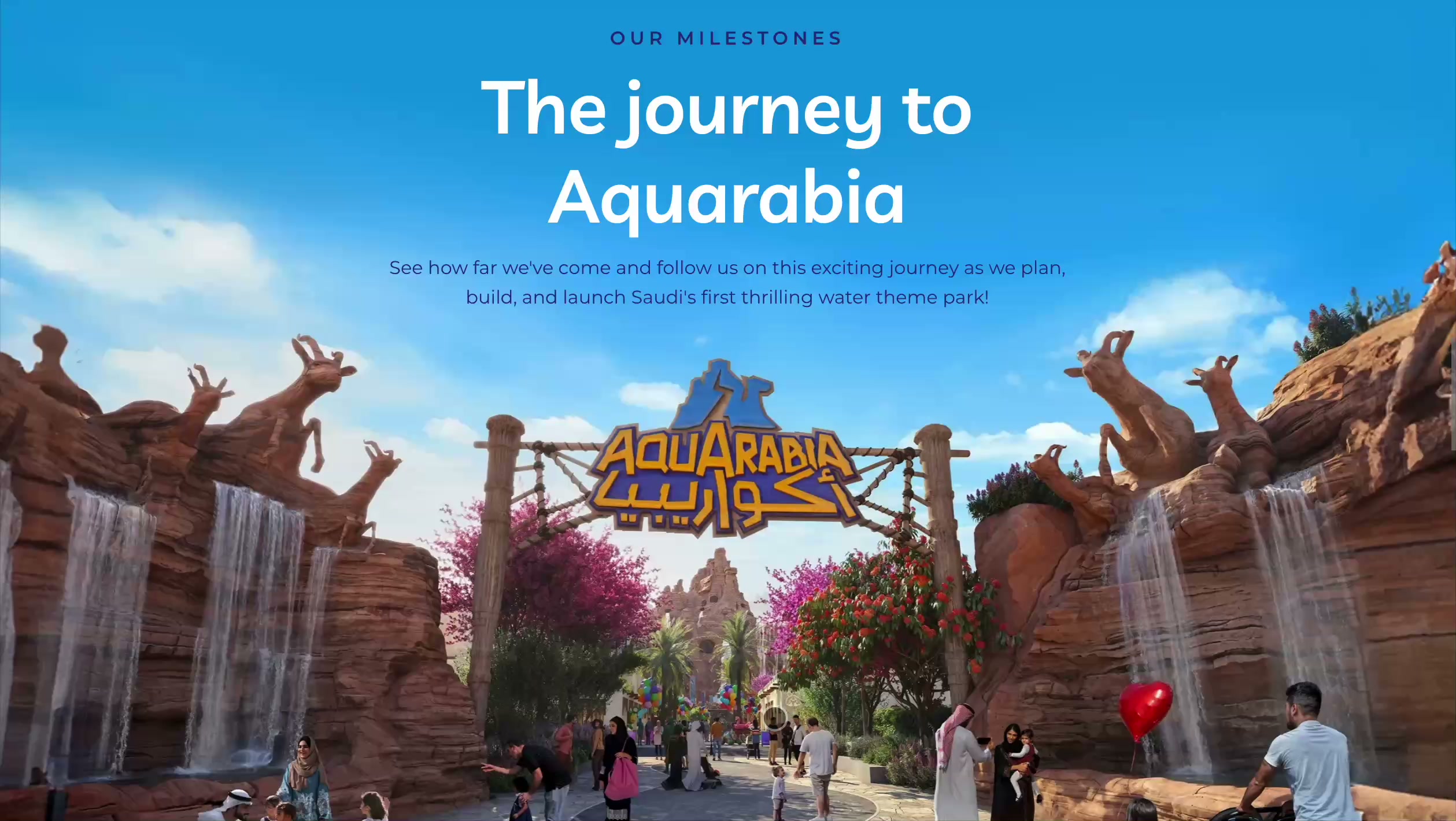
Component 02
Problem
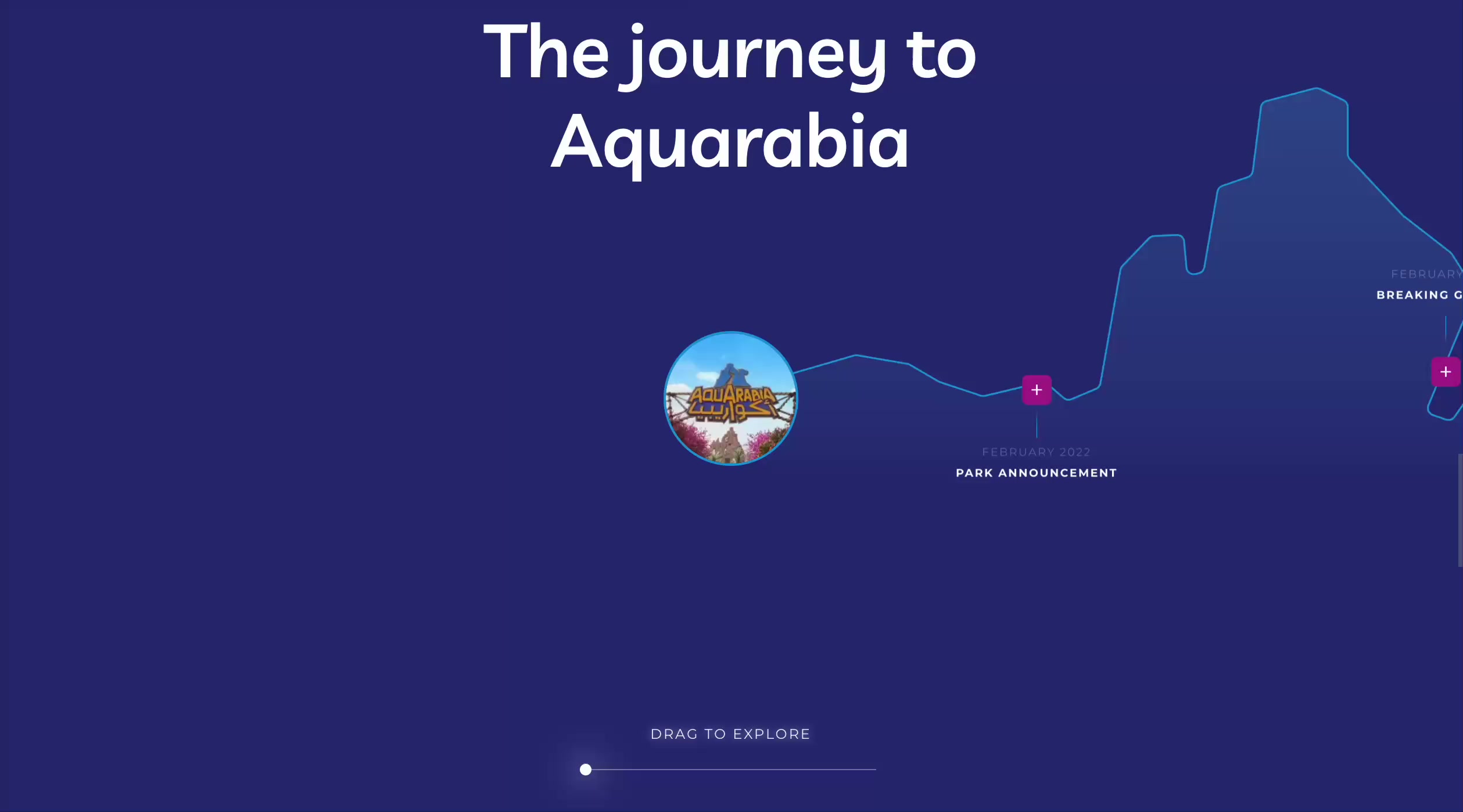
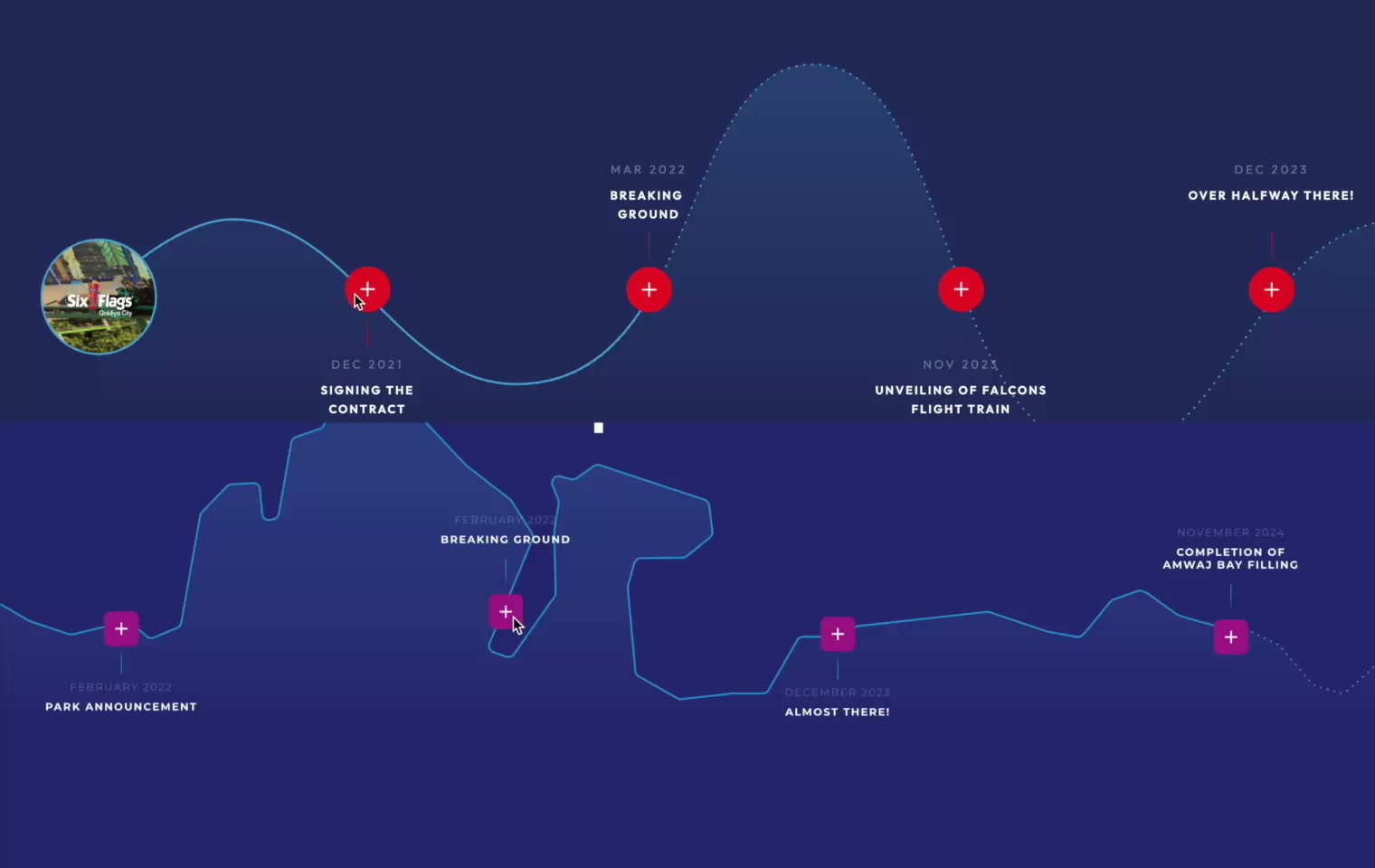
People needed to grasp the park's scale and progress without static, long-form content.
Solution
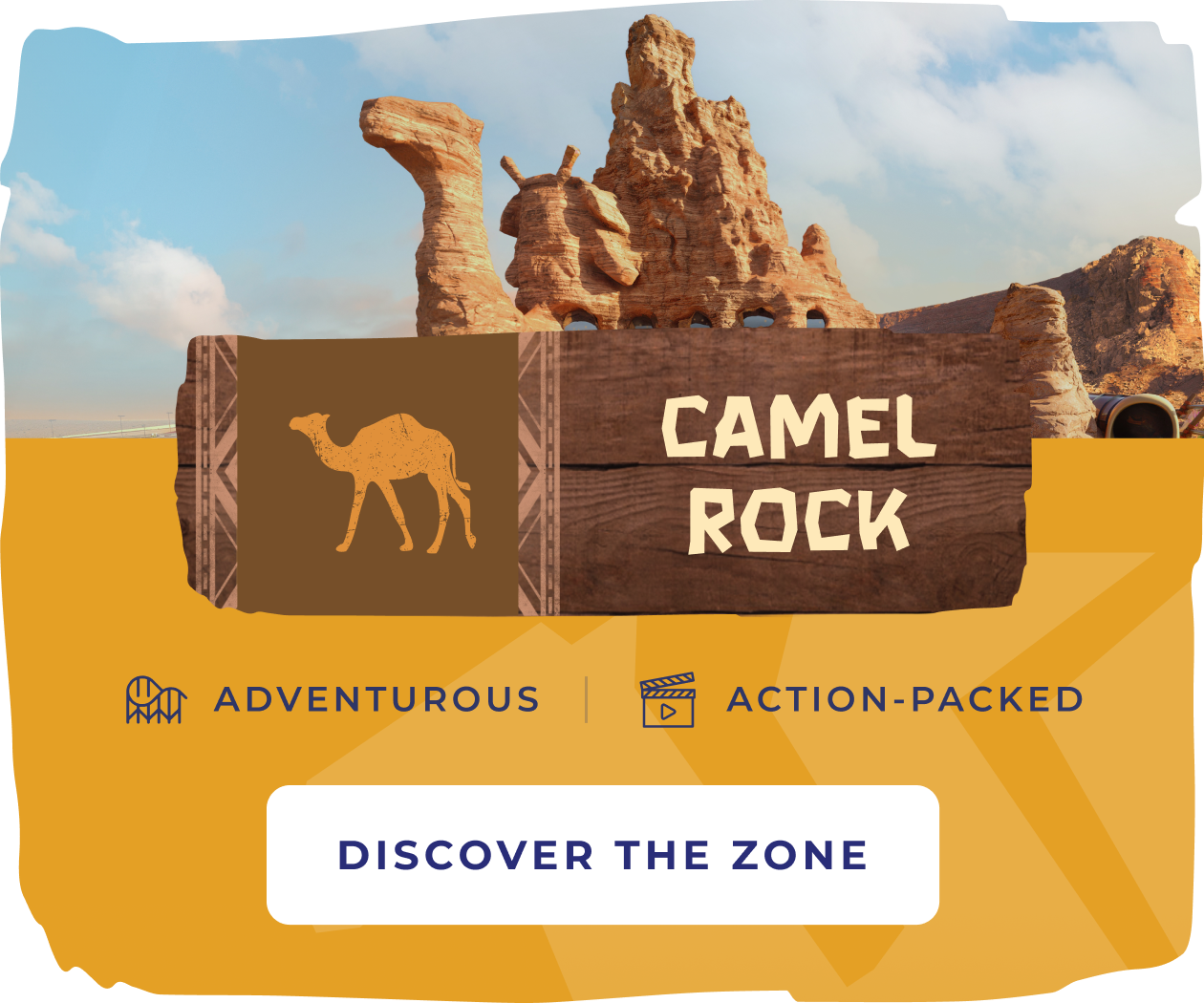
Milestone elements shaped after the Camel Rock icon from the logo, making key highlights memorable.
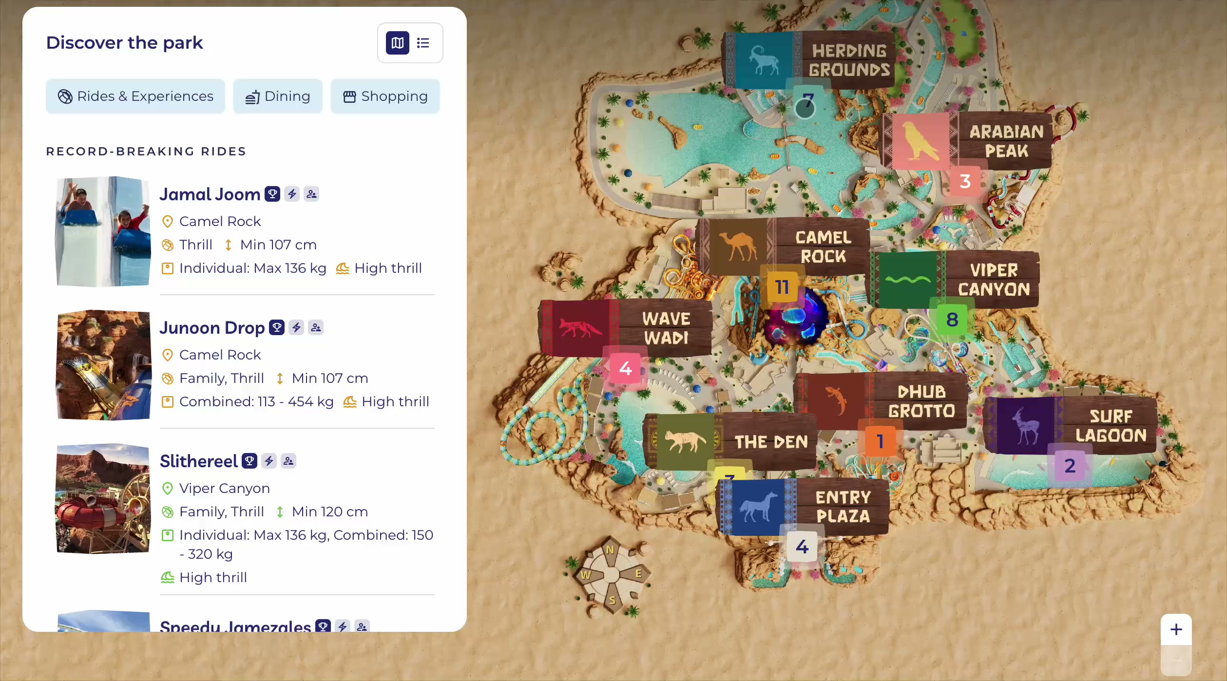
Component 03
Problem
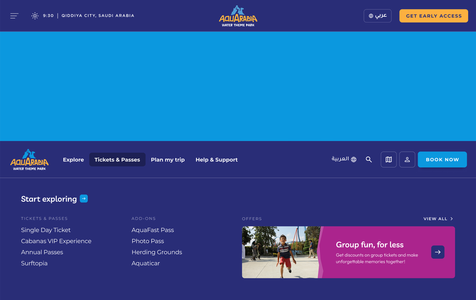
People needed a clear picture of how the park fits together: zones, offerings and how they relate.
Solution
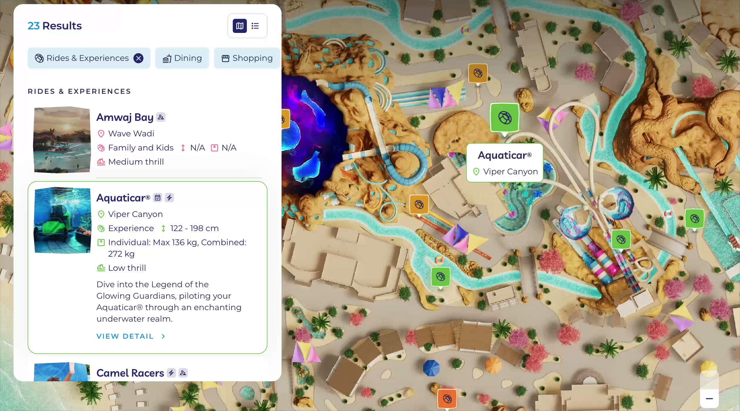
Explore the park by zone, and filter attractions, dining and shopping.
Decision 01
With no brand system to start from, the logo became our foundation. Its rocky geometry turned into the breakers and transitions across the platform, giving the site a recognizable rhythm while the wider identity was still evolving.
Decision 02
Both parks shared a design system, but Six Flags leaned dark and high-contrast. Aquarabia needed to feel lighter and more playful, so brighter colors, fluid transitions and softer curves set it apart while keeping it part of the Qiddiya family.
Decision 03
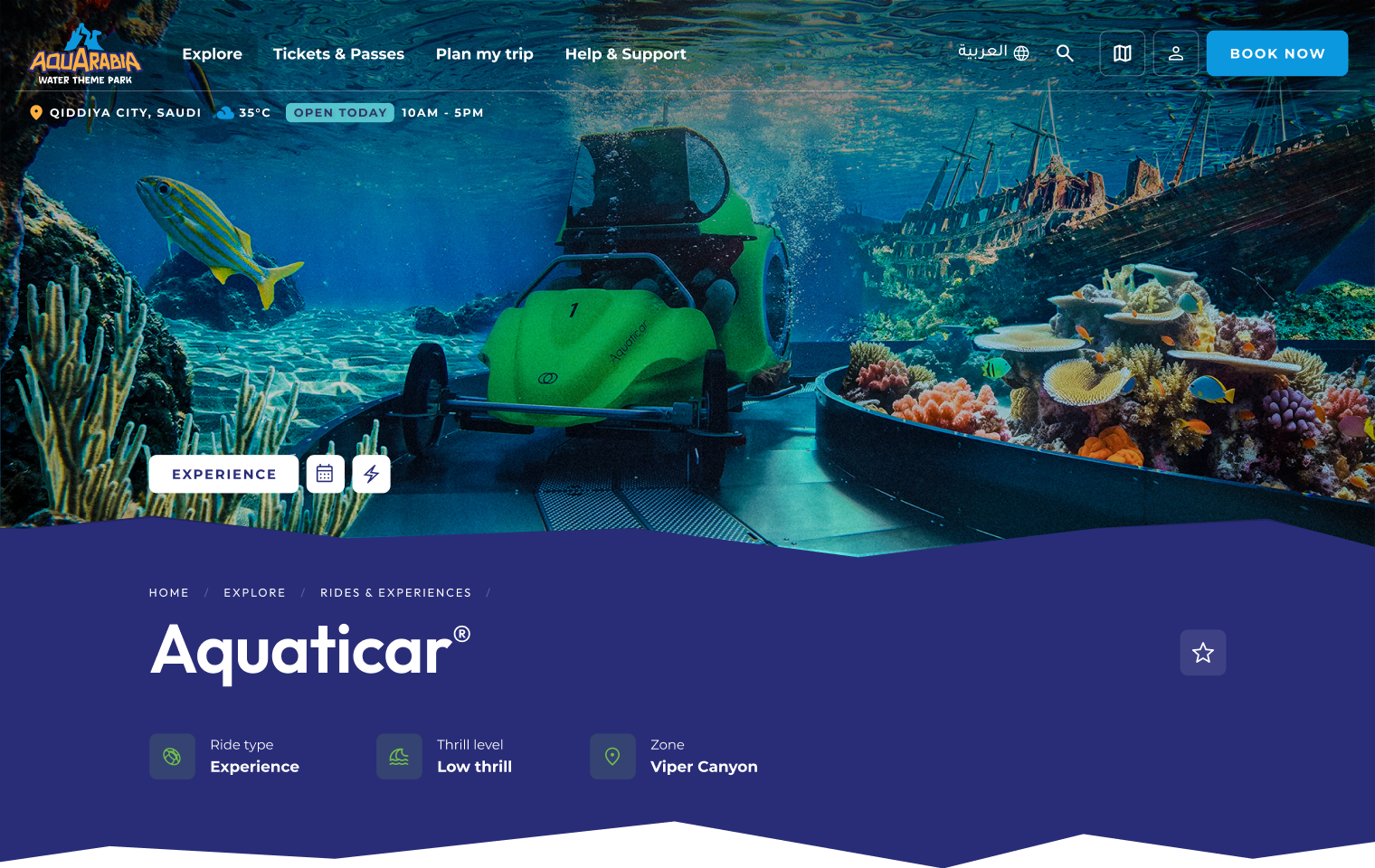
Aquarabia offers far more than rides: surfing, kayaking and Aquaticar. Discovery components show rides and experiences together, so visitors see the full range at once.
Decision 04
Park details kept changing throughout the project, so the interface was built from modular components that scale across phases. New content slots in without a redesign.
01
Working on Aquarabia highlighted how digital design can influence an emerging brand.
02
Because the platform was developed before the brand was finalized, early design exploration played a role in shaping the visual language of the destination.
03
The project reinforced the importance of flexible systems, collaboration across teams, and designing products that can evolve alongside the destinations they represent.
Next Case Study
AI Audit System
A custom Claude-based design audit and competitive benchmarking system, built to run UX evaluations the way an experienced designer would.
View Case Study