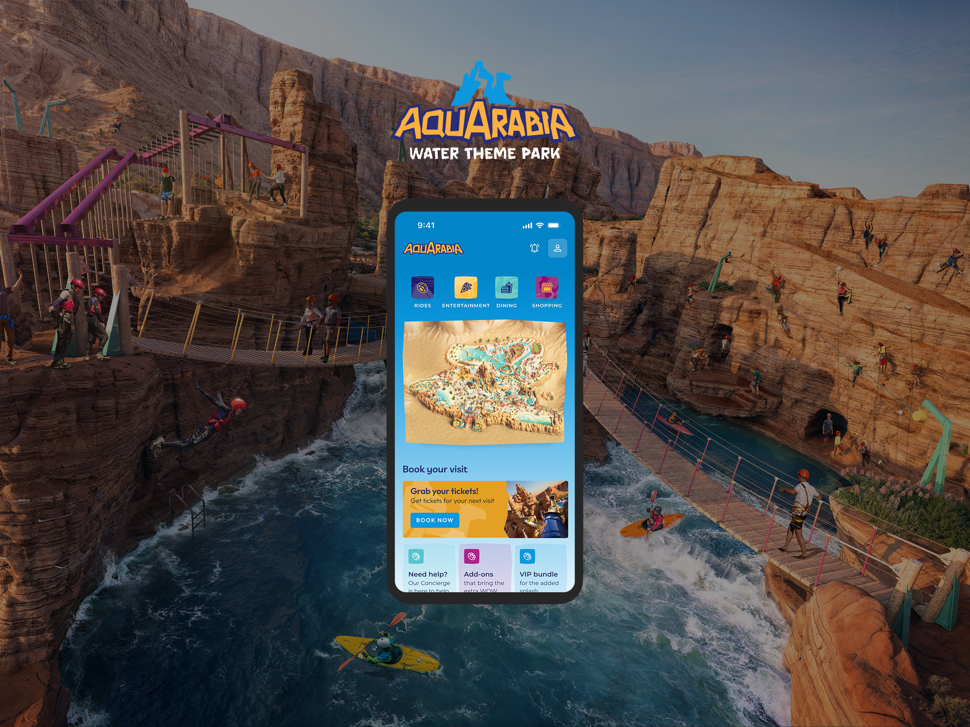
Website and App · 2023 - 2026
Six Flags Qiddiya City
Designing the flagship digital experience for the world's largest theme park, introducing a brand-new destination to the world before it opens.
Building belief for a destination that didn't yet exist.
Impact
- Platform launched ahead of park opening to drive early awareness and engagement
- Established the digital foundation for future booking and mobile experiences
- Scaled across multiple phases, evolving alongside the park's development

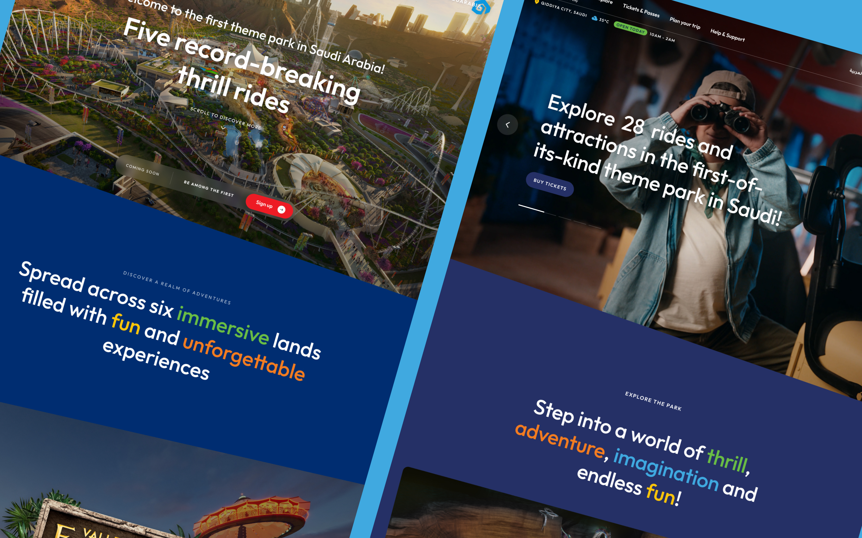
Six Flags Qiddiya City needed a digital platform to introduce a destination that didn't yet exist.
While Six Flags is a globally recognized brand, theme parks were still relatively unfamiliar to much of the local audience, requiring the platform to educate, build excitement, and establish trust ahead of launch.
With an evolving opening timeline, the experience had to scale over time, starting with awareness and progressively supporting deeper exploration, future content, and eventual booking.
Business Goals
- Drive early awareness of the park before launch
- Educate the market on the theme park experience
- Capture sign-ups for launch announcements
- Establish visual language for future digital phases
User Goals
- Understand what Six Flags Qiddiya City is
- Explore rides, lands, and scale of the experience
- Get excited about the destination before it exists
- Know when and how to plan a visit
Design Challenge
"How might we introduce a destination that doesn't exist yet, while building enough excitement and clarity that people plan to visit before a single ride is built?"
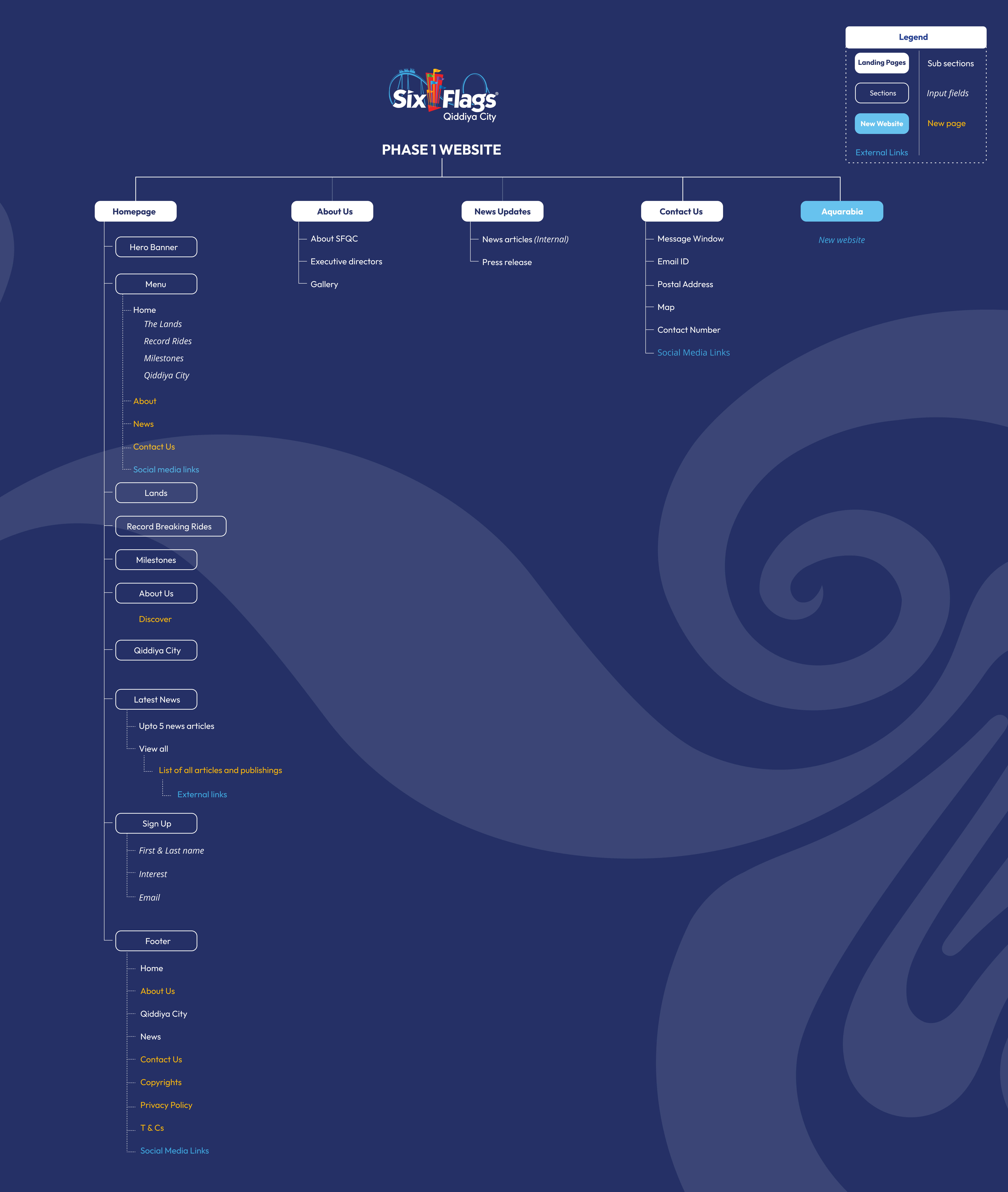
- Led UI design for the entire website and app experience, from the homepage through to all content pages
- Defining the visual system including color language, typography hierarchy, and motion principles
- Designing key components including ride cards, lands explorer, development timeline, and signup flows
- Preparing design-engineering handoff including specs, states, and interaction behaviors
- Presenting design concepts directly to stakeholders and iterating across multiple rounds of feedback
- Collaborating with product teams on experience strategy and information architecture
Due to the scale and complexity of the project, I also supported tasks beyond traditional design responsibilities including: content population, English copywriting, and Arabic content preparation, ensuring the platform launched with a consistent and polished experience.
Unknown opening date
The platform had to build excitement and credibility without a confirmed launch timeline, and every design decision had to work without that anchor.
Incomplete brand guidelines
The visual identity was being defined in parallel with the digital build, with the design system and brand language evolving simultaneously.
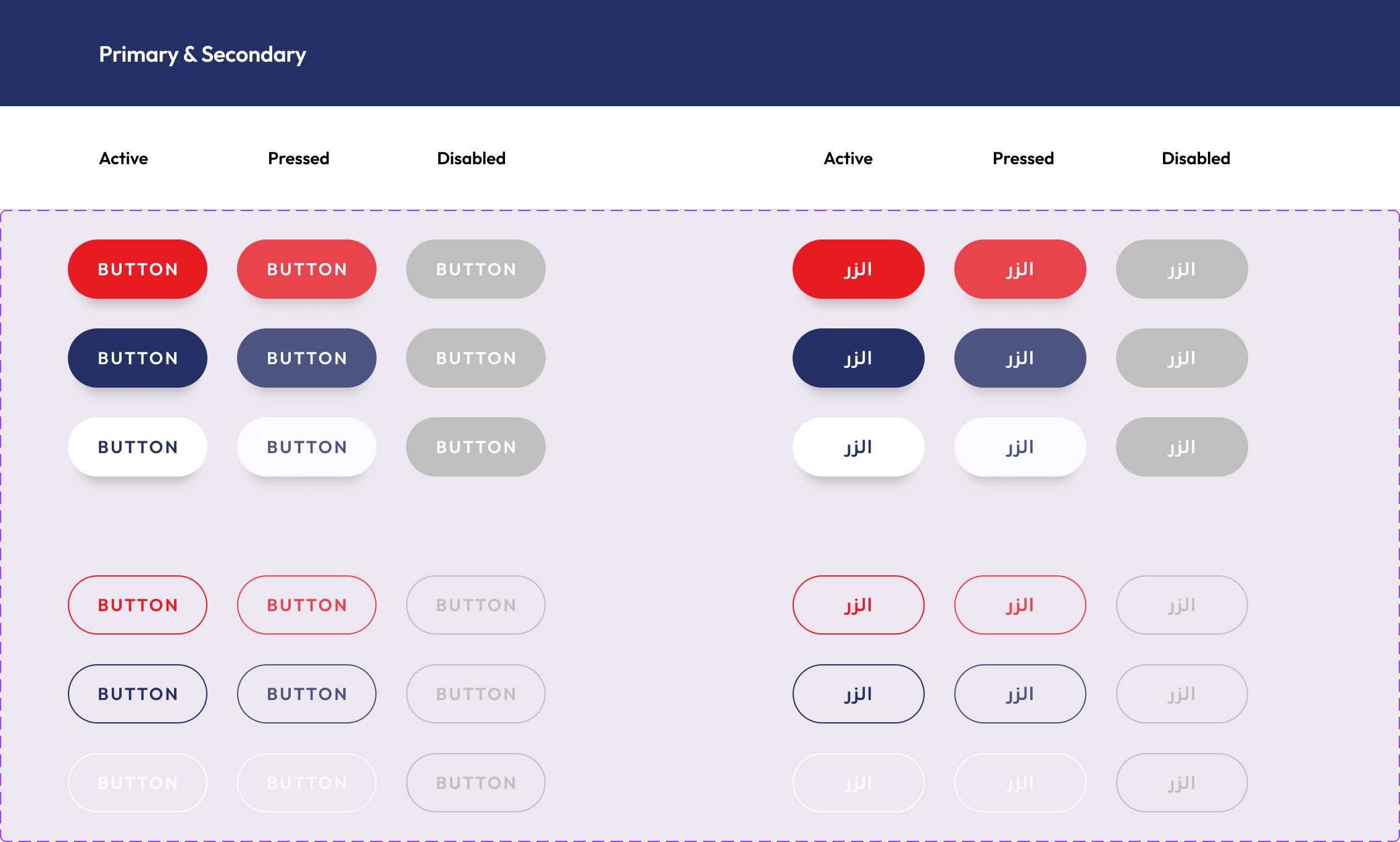
Bilingual: English & Arabic
All components, layouts, and interactions had to function equally well in both LTR and RTL, with no retrofitting, built in from the start.
Multiple stakeholder layers
Decisions passed through the client, Six Flags brand, and Qiddiya Development Authority, with alignment requiring iterative presentations across all three.
Market unfamiliarity
Theme parks were a relatively new concept for much of the regional audience, so the platform had to educate and excite simultaneously.
Phased delivery
The platform needed to launch, evolve, and scale across multiple releases as the park progressed toward opening, and the architecture had to support this from day one.
The platform needed to function as both a product experience and a belief-building tool before the park physically opened.
Designing the platform meant building belief before the park existed, requiring the experience to function as both a product and a marketing tool.
The fundamental challenge was credibility. Without a physical park to experience yet, the platform had to make visitors believe in the destination. To introduce the park effectively, the digital experience needed to accomplish four things:
01
Explain the destination
Introduce Six Flags Qiddiya City and position it as a major entertainment landmark.
02
Showcase the scale
Highlight record-breaking rides and themed lands to communicate the magnitude of the park.
03
Build excitement
Use immersive visuals and interactions to create anticipation.
04
Capture interest
Encourage visitors to sign up for updates as the park moved toward launch.
This led to a story-driven homepage structure where each section moves the visitor further along that journey, from awareness to anticipation to action.
The visual direction needed to feel bold and cinematic, matching the scale of the physical experience while remaining clear enough to communicate information quickly to first-time visitors.
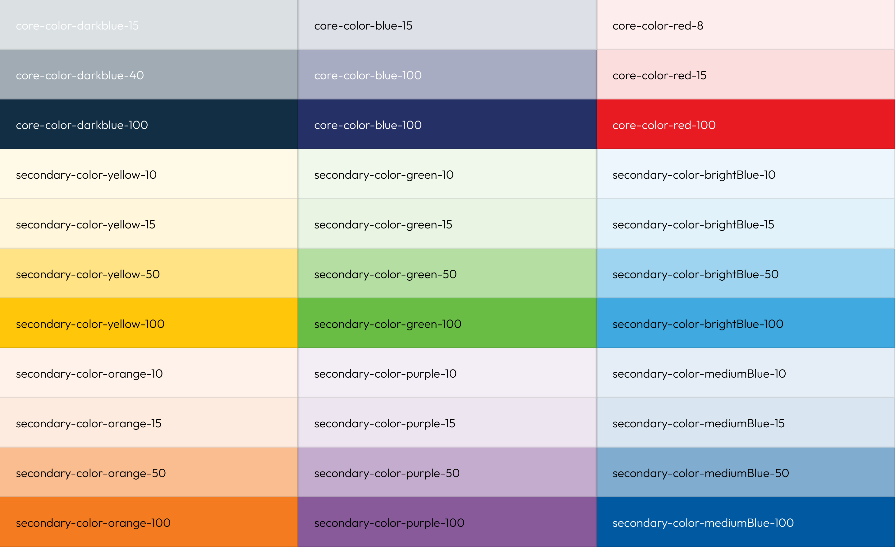
Color System
The platform builds upon the existing Six Flags brand colors, using red and blue as the primary visual anchors. These are applied as section backgrounds, highlight accents, and primary CTAs to keep the digital experience tightly aligned with the global identity.
A restrained neutral palette supports readability and content hierarchy, ensuring the brand colors remain the focal point throughout.
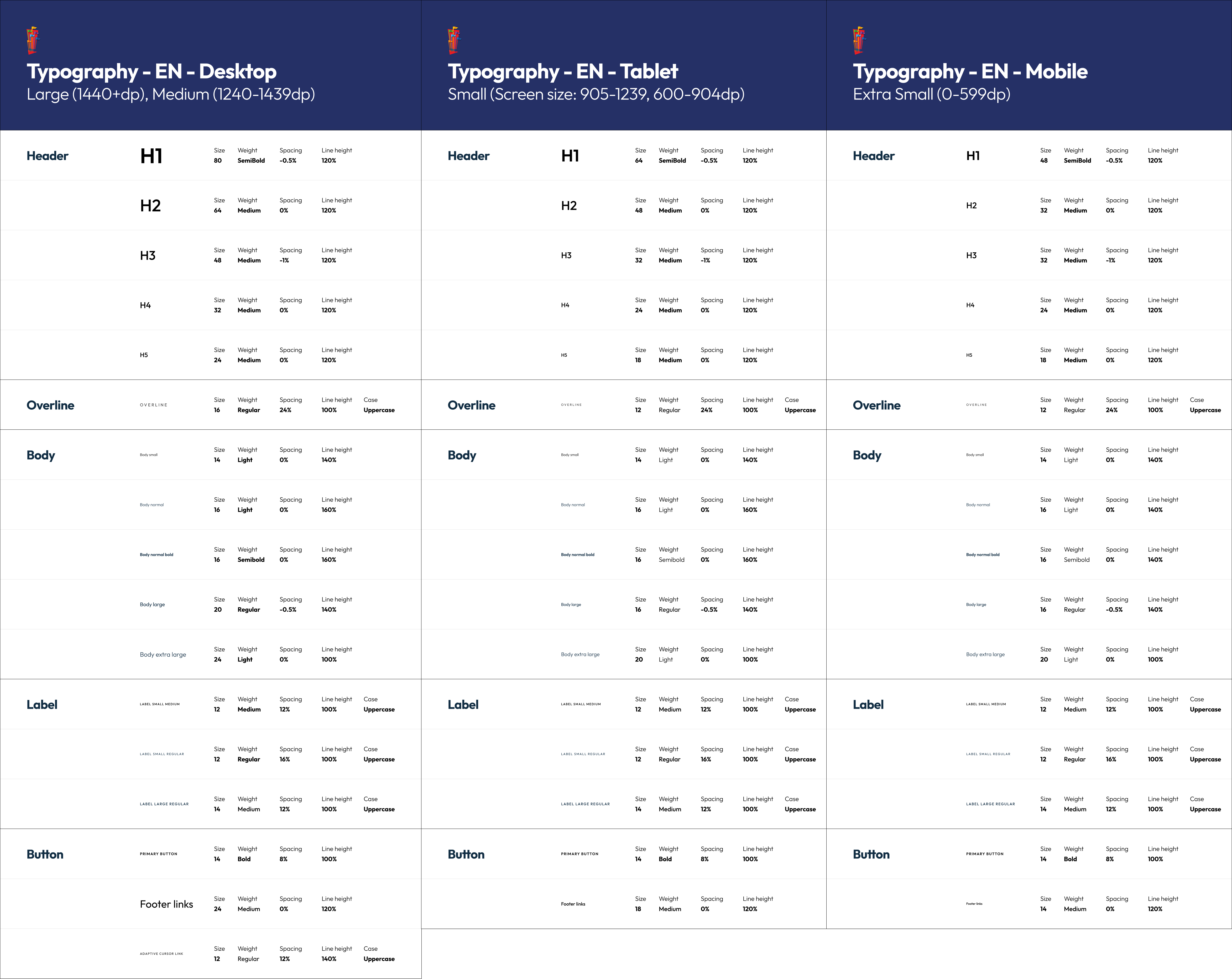
Typography Scale
The platform uses Outfit as the primary digital typeface. Its geometric structure aligns with the Six Flags logo while offering strong readability across devices and screen sizes.
Typography was structured to create clear hierarchy across headlines, ride statistics, and descriptive content — each with a distinct scale and weight.
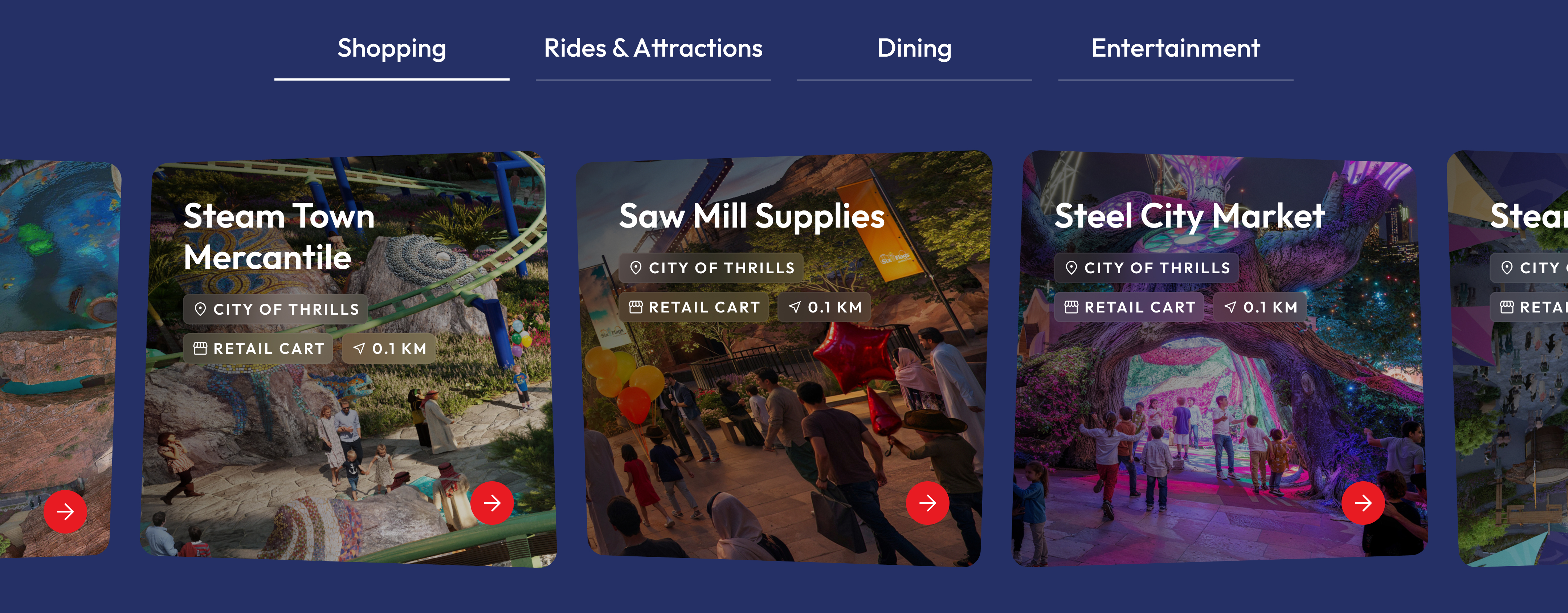
Component Library
A modular component system was established to support the platform's phased rollout and ensure consistency across pages.
Cards, carousels, overlays, and navigation patterns were designed to scale as new content and features were introduced in later phases.
Motion Principles
Motion plays an important role in guiding users through the experience. Transitions, hover states, and animated elements reinforce hierarchy and communicate interactivity.
Each motion decision was intentional — helping maintain momentum and a sense of energy that reflects the physical park experience.
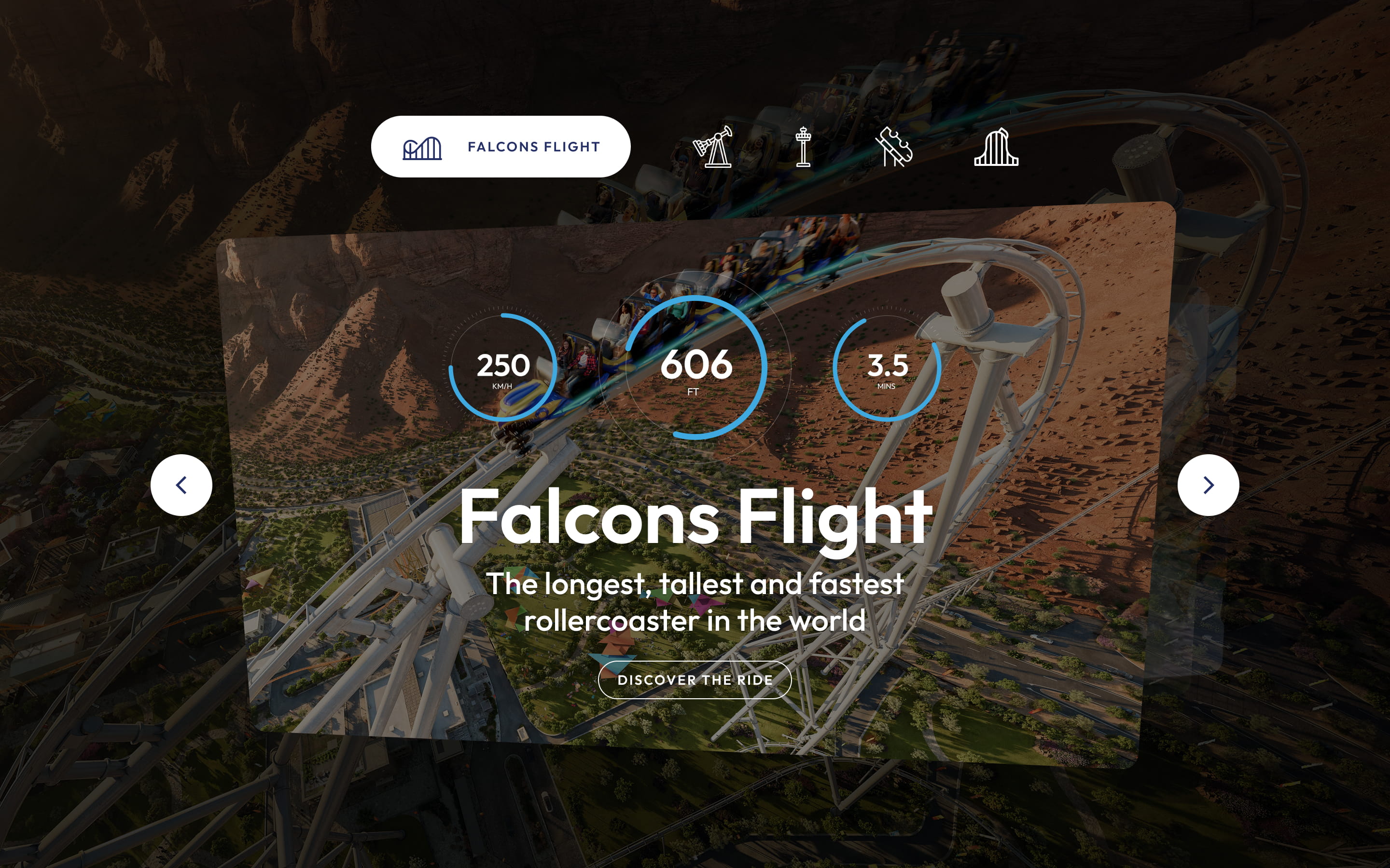
Component 01
Record-Breaking Rides Carousel
Problem
One of the park's biggest differentiators was its record-breaking rides, but users needed a way to quickly explore these attractions and understand their scale without leaving the homepage or losing browsing momentum.
Solution
An interactive carousel that showcases the park's headline rides through short cinematic previews and animated statistics. Each slide combines motion, numbers, and concise information to communicate the scale of each attraction in seconds.
Component 02
Milestones
Problem
Because the park had not yet opened, visitors needed reassurance that the destination was actively progressing. Simply listing construction updates would not build excitement or trust.
Solution
An immersive timeline that transforms the park's development milestones into an interactive storytelling experience. As users enter the section, scrolling temporarily locks while the background image transitions into the first node of the timeline. From there, visitors can explore milestones through draggable navigation and expandable content cards.
Component 03
Lands Explorer
Problem
Six Flags Qiddiya City consists of six themed lands, each with its own identity and attractions. Users needed an intuitive way to understand the variety and scale of the park experience.
Solution
An immersive lands explorer where each land is represented through a full-width visual preview, supported by a carousel of land logos that allows visitors to quickly navigate between them. Selecting a land reveals its visual identity while clicking the background opens an overlay with additional details.
These components were initially designed for the Phase 1 awareness stage of the platform and were later expanded and refined across subsequent website phases and the mobile app experience.
Interactions were designed to feel cinematic but purposeful, every animation serves to guide attention not decorate. The principle: motion should always answer "where should I look next?"
Scroll-Based Storytelling
The platform relies heavily on scroll-driven interactions to guide visitors through the narrative.
Content is revealed progressively as users move through the page, creating a sense of progression that mirrors the journey they might one day take through the park itself.
Motion as Visual Hierarchy
Motion was used to establish visual hierarchy and direct attention throughout the interface.
Subtle animations draw focus toward calls to action, interactive elements, and transitions between sections, ensuring users always know where to look without the interface feeling restless.
Responsive Interaction
Because the platform had to work across desktop, tablet, and mobile, interactions were designed to adapt to different input types.
Hover interactions transition to tap on mobile, and motion was calibrated to maintain the same level of clarity and narrative flow across every screen size, from wide desktop down to small phone.
Decision 01: Translating the Brand into a Digital Design Language
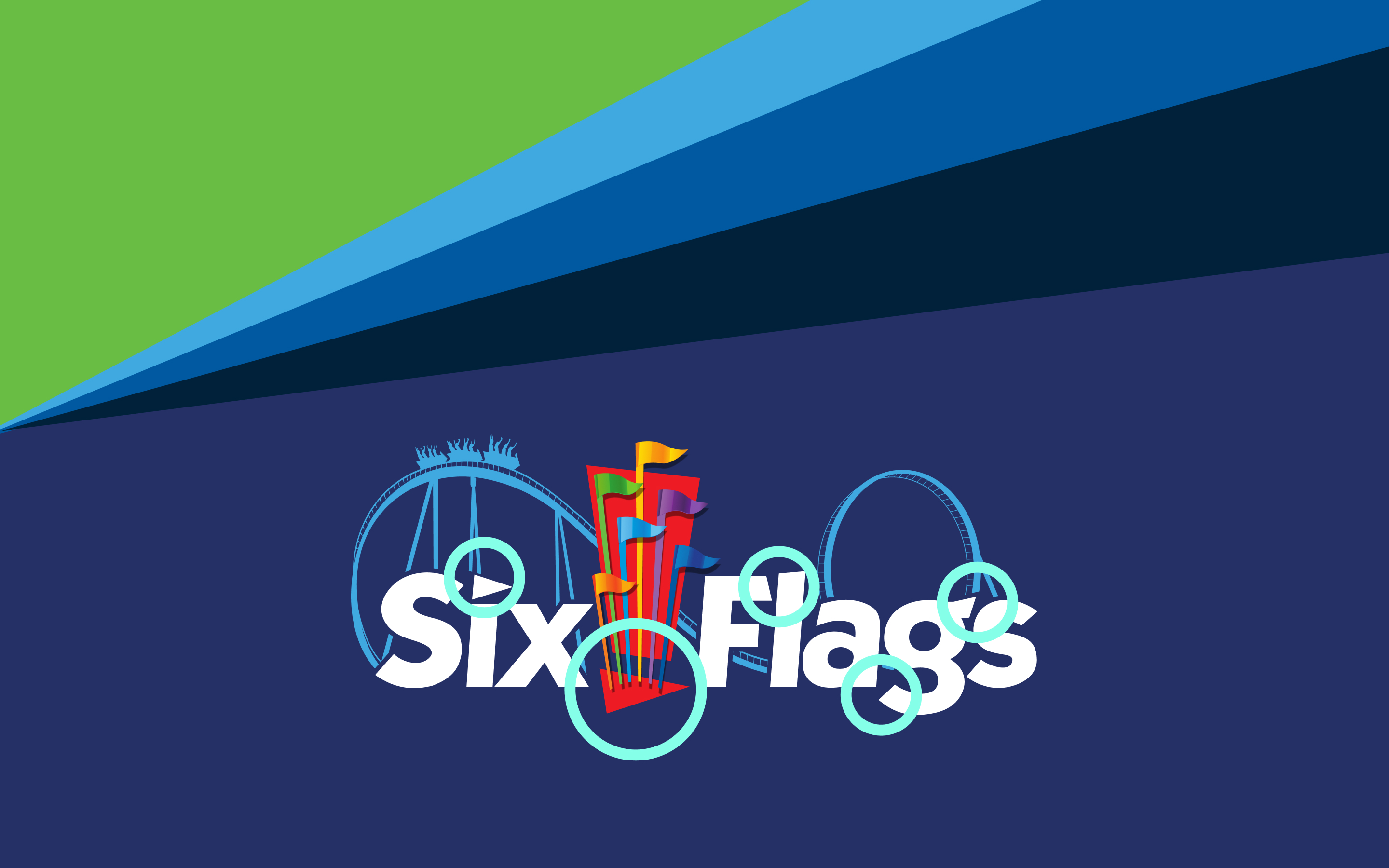
Rather than building a new visual direction, we leaned into the Six Flags brand as the foundation. The core colors, red and blue, carried through section backgrounds, highlight accents, and primary CTAs, keeping the digital experience tightly aligned with the global identity.
We also extracted the angled cut from the Six Flags logo flag shape and turned it into a recurring motif. These "breaker cuts" became signature transitions between hero sections and content blocks, while rounded corners across cards echoed the curves of roller coaster tracks.
This was a deliberate shift away from neutral UI patterns, ensuring the experience felt unmistakably tied to the Six Flags brand rather than a generic entertainment platform.
Decision 02: Prioritizing Record-Breaking Rides on the Homepage
Instead of separating rides into a subpage, we placed the park's record-breaking attractions directly on the homepage. These were the strongest differentiator and the content most likely to hook theme park enthusiasts early in the experience.
An interactive carousel let visitors explore multiple rides without leaving the homepage flow. Later phases introduced dedicated ride pages and filtering, scaling the experience as more content became available closer to launch.
We chose to surface rides early despite limited supporting content, prioritizing excitement and differentiation over completeness to capture attention in the first interaction.
Decision 03: Excluding Ticket Pricing During the Awareness Phase
Ticket pricing was intentionally left out of the initial platform. Introducing it before the park opened would have shifted the experience toward comparison and transaction, while Phase 1 was focused entirely on awareness and excitement.
A signup flow replaced pricing as the primary CTA, letting visitors register interest and receive updates as the park progressed. This kept the experience aligned with the project's early stage while building an engaged audience.
Decision 04: Designing the Platform for Phased Evolution
With the opening timeline still evolving, the platform needed to support multiple releases over time. We treated it as a product rather than a static site: Phase 1 focused on awareness, with later phases adding ride detail, dining, partner content, and eventually planning tools.
Components and navigation patterns were designed to scale, allowing new features to slot in without disrupting the experience. The platform grew alongside the park's development while staying consistent across every release.
Multi-phase Platform
Experience designed to evolve from awareness to booking
Bilingual Experience
Arabic (RTL) and English (LTR) across the entire platform
Web + Mobile
Consistent experience across responsive web and mobile app
- Defined the digital foundation used to introduce Six Flags Qiddiya City globally ahead of its physical launch.
- Platform launched as the first digital introduction of the park to a global audience
- Visual language adopted by client for future digital phases and brand applications
- Stakeholders praised the clarity of the storytelling structure
- Component library delivered to engineering, enabling consistent, scalable implementation
01
Destination brands without physical proof require emotional architecture first. The IA decisions that mattered most weren't about navigation; they were about the sequence of belief-building. Emotion before information, every time.
02
A design system pays off faster than expected when the team is large and the timeline is short. Building the component library before designing the pages felt slow in week two and saved three weeks in month five.
03
Stakeholder alignment is a design problem, not a communication problem. The presentations that landed best weren't the most polished; they were the ones that gave stakeholders a clear "yes or no" to a specific decision, not a gallery to react to.