Scroll-Based Storytelling
Content reveals as you scroll, so moving down the page mirrors the journey through the park.
Website and App · 2023 - 2026
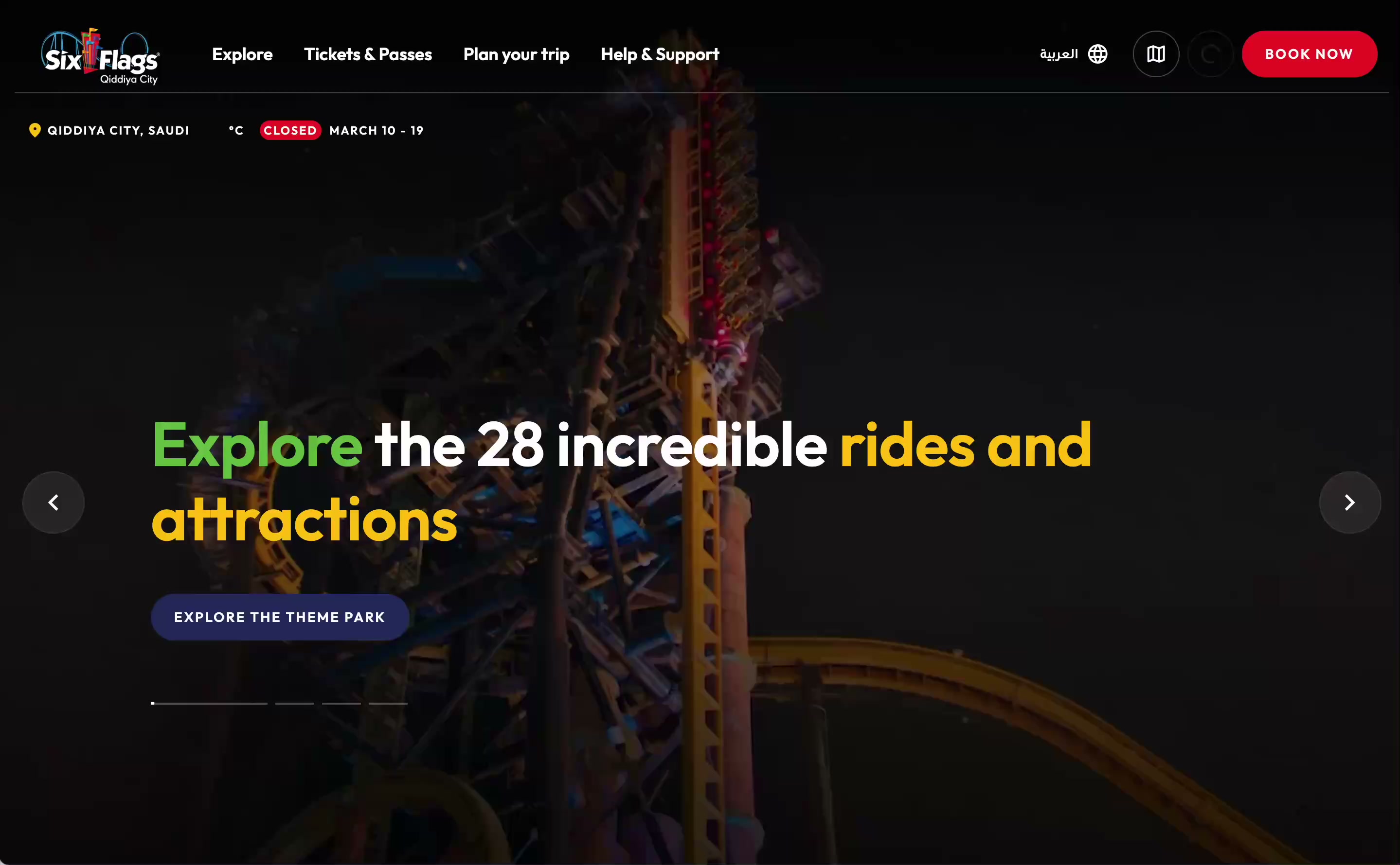
The flagship digital platform for a record-breaking theme park, built to introduce it to the world before it opened.
Building belief for a destination that didn't yet exist.

The challenge
A digital platform for a park that didn't exist yet.
The approach
Treat the platform as both product and persuasion: something to explore, and a reason to believe, before the park opened.
Impact
Business Goals
User Goals
Design Challenge
"How might we introduce a destination that doesn't exist yet, while building enough excitement and clarity that people plan to visit before a single ride is built?"
Given the scale of the project, I also took on work beyond design: content population, English copywriting and Arabic content preparation, so the platform launched consistent and polished.
01
Build excitement and credibility with no confirmed launch date to anchor on.
02
The visual identity was defined while we built, so the design system evolved alongside it.
03
Decisions passed through the client, Six Flags brand and Qiddiya Development Authority, aligned through rounds of presentations.
04
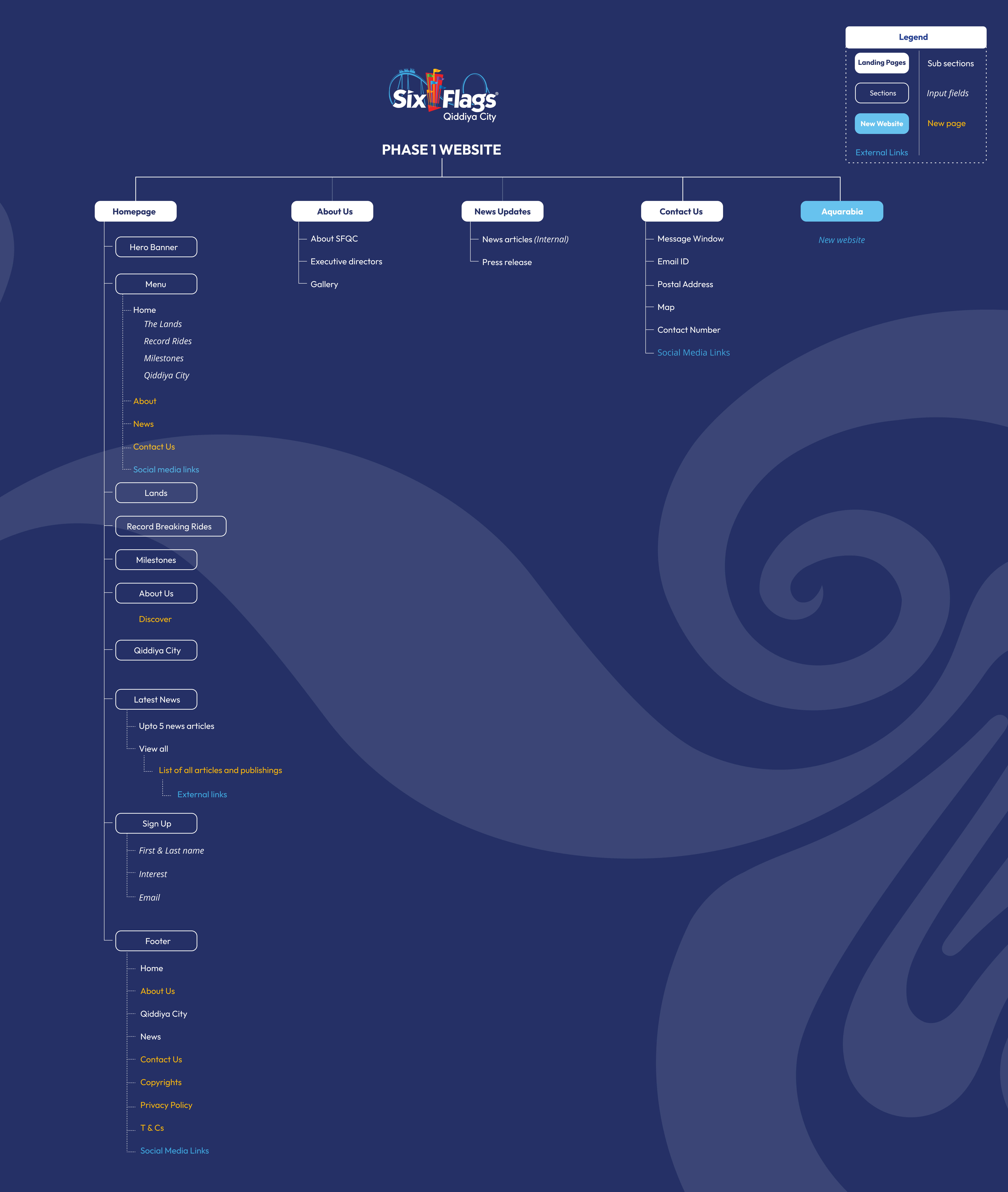
Launch first, then grow release by release toward opening, so the architecture supported that from day one.
01
Introduce Six Flags Qiddiya City and position it as a major entertainment landmark.
02
Highlight record-breaking rides and themed lands to communicate the magnitude of the park.
03
Use immersive visuals and interactions to create anticipation.
04
Encourage visitors to sign up for updates as the park moved toward launch.
Bold and cinematic to match the park's scale, but clear enough for first-time visitors to take in quickly.
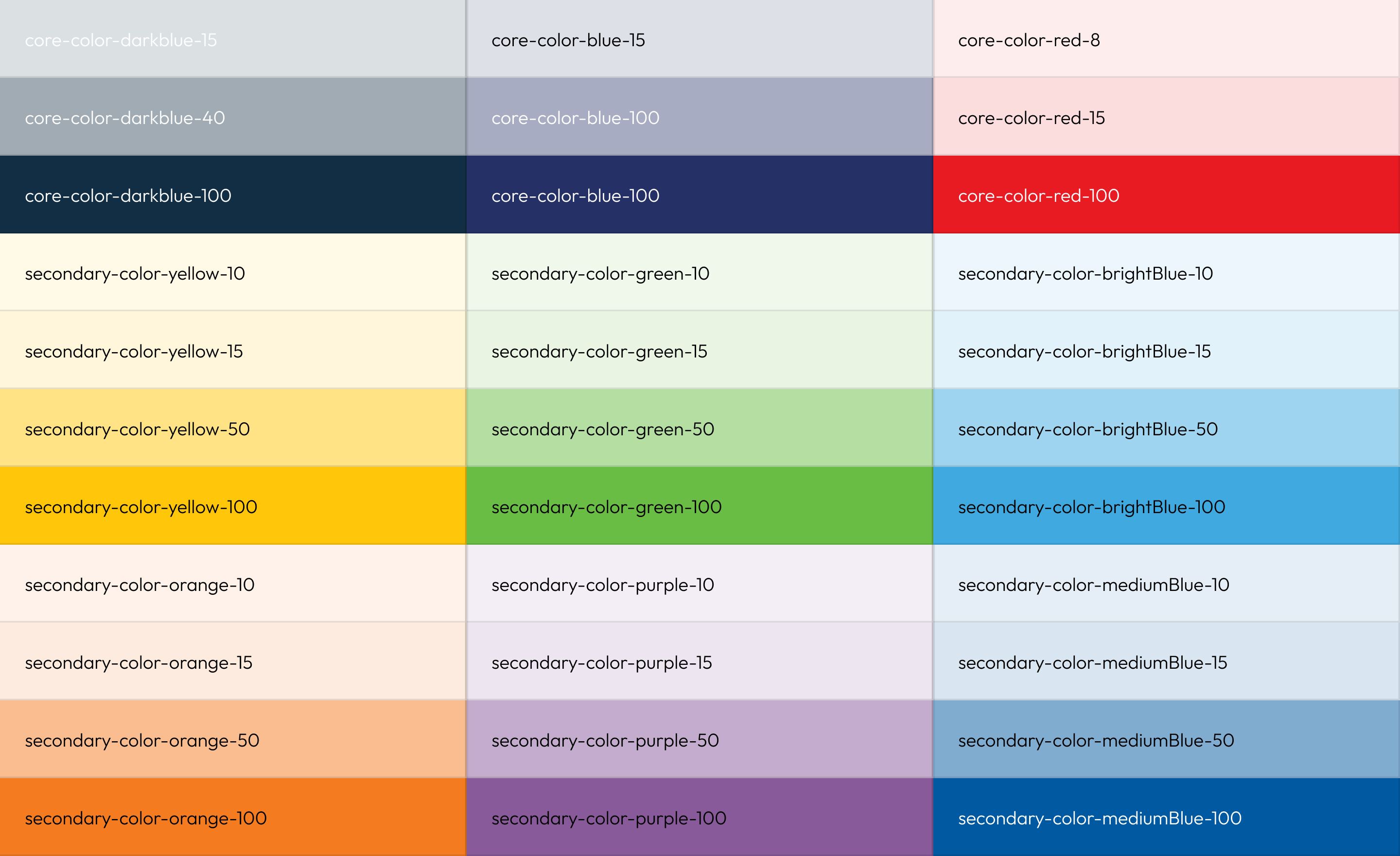
Built on Six Flags' red and blue, used for section backgrounds, accents and primary CTAs. A restrained neutral palette keeps content readable and lets the brand colors lead.
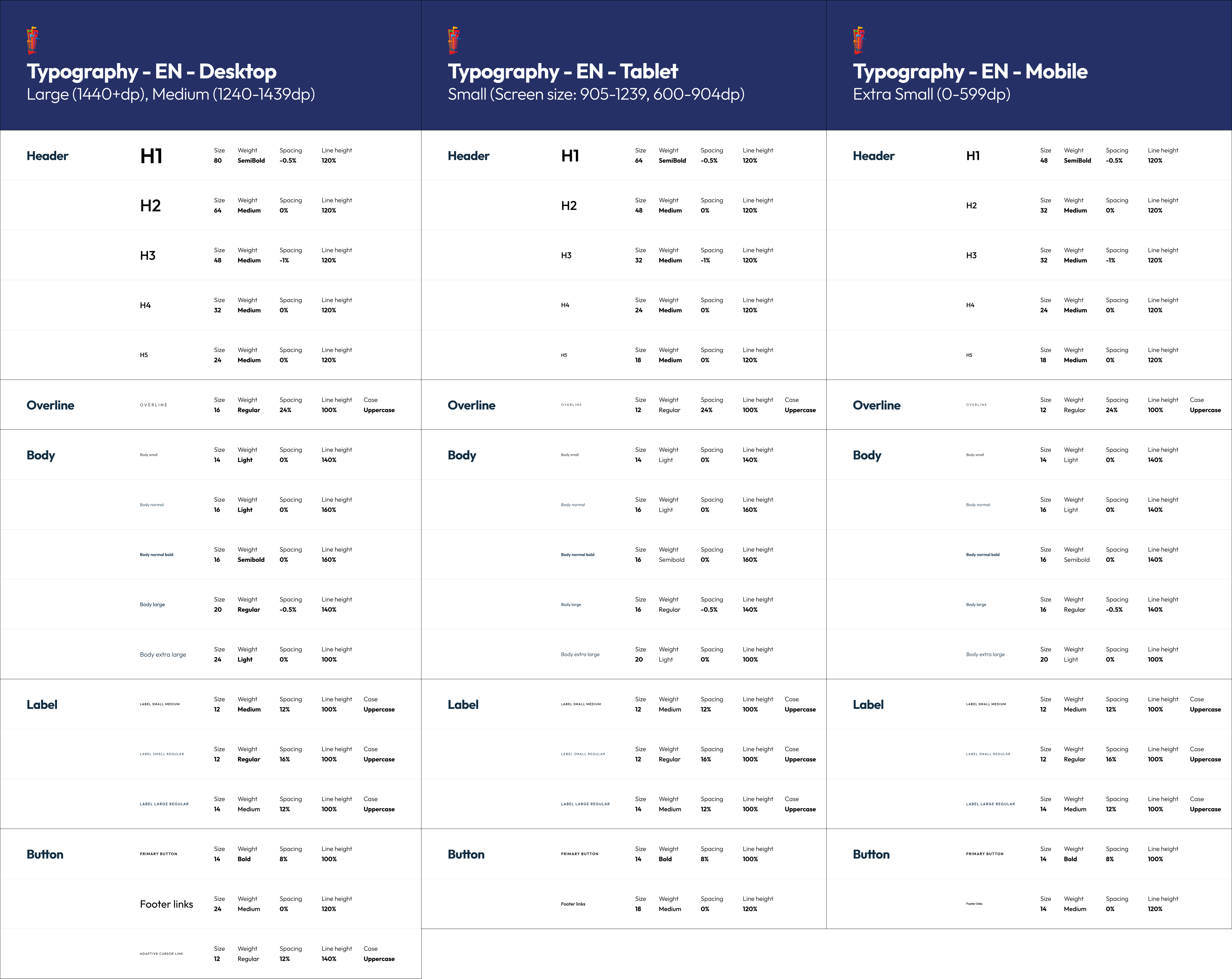
Outfit is the primary typeface: geometric like the Six Flags logo, and readable on every screen. A clear scale separates headlines, ride stats and body copy.
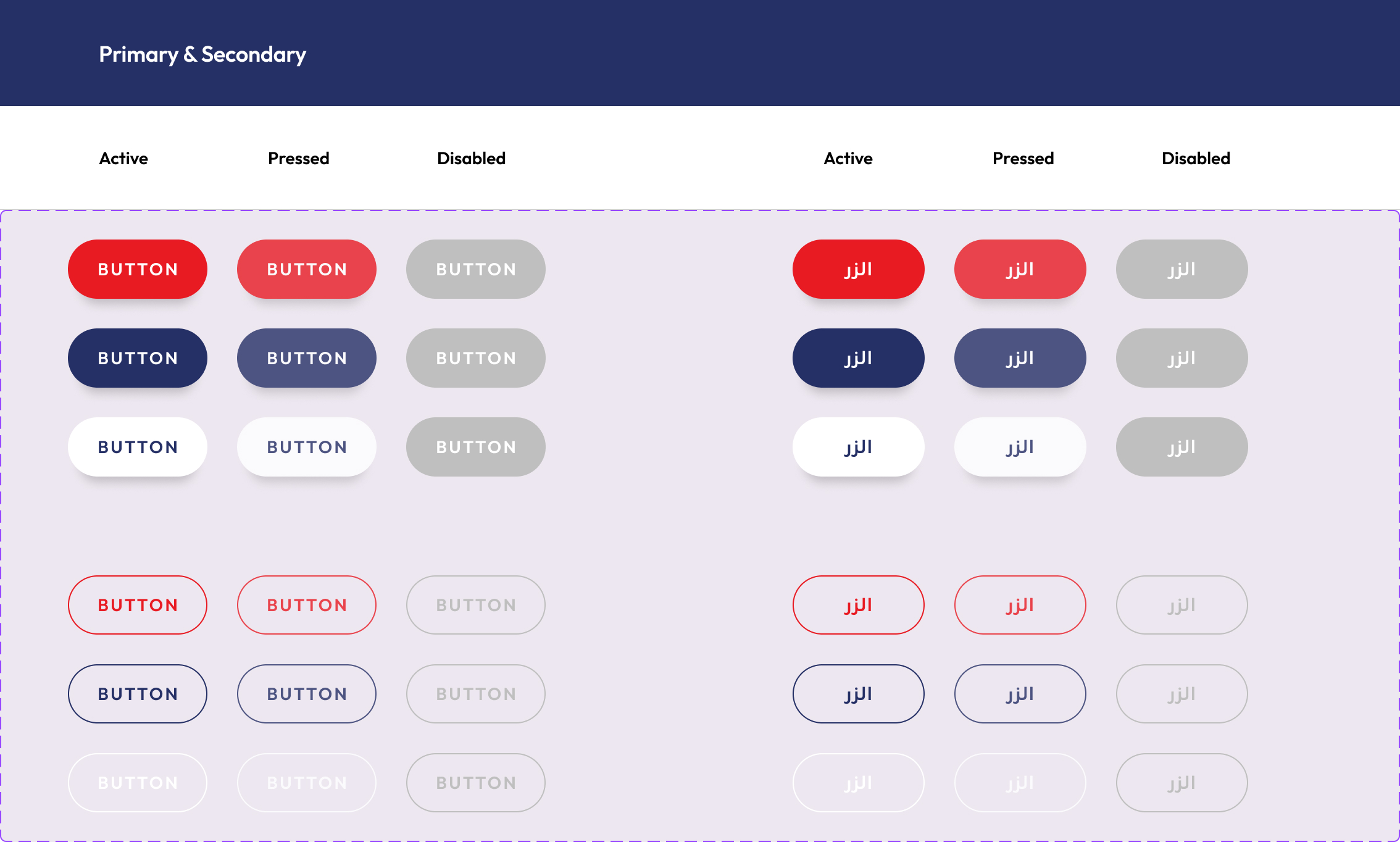
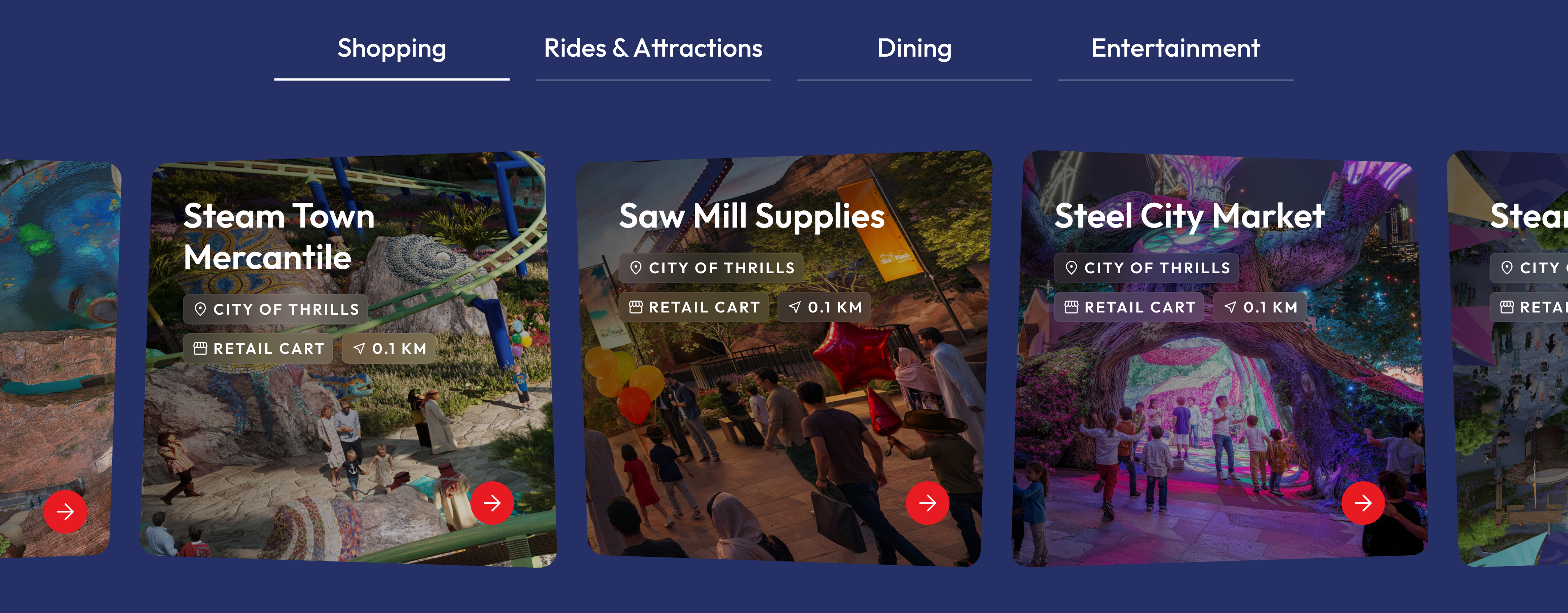
Cards, carousels, overlays and navigation, built as a modular library so new content and features could slot in during later phases.
Transitions, hover states and animation reinforce hierarchy and signal what's interactive, carrying the park's energy without the noise.
Cinematic, but never decorative. Every animation had to answer one question: "where should I look next?"
Content reveals as you scroll, so moving down the page mirrors the journey through the park.
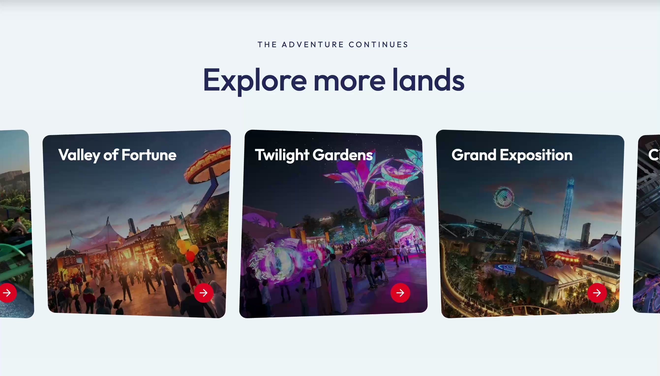
Subtle motion pulls focus to calls to action and section changes, so people know where to look without the interface feeling restless.
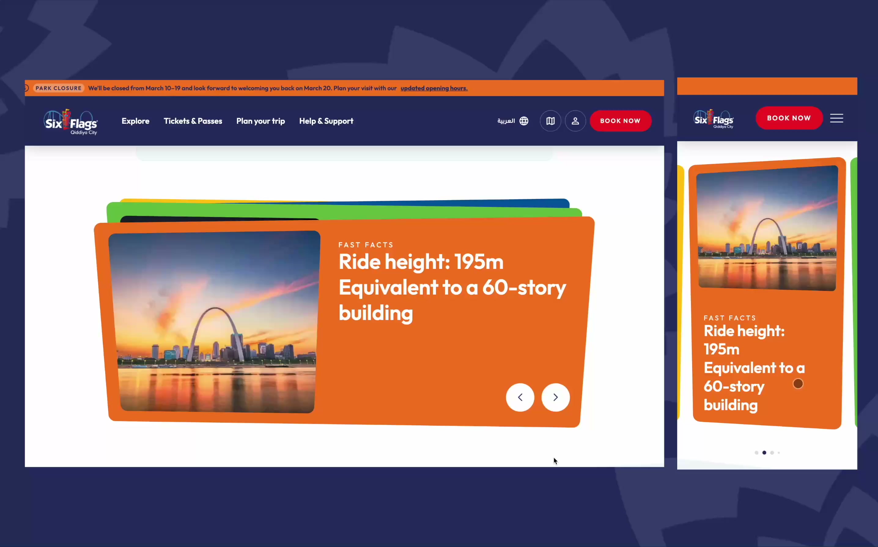
Hover becomes tap on mobile, and motion is tuned so the story reads the same from wide desktop to small phone.
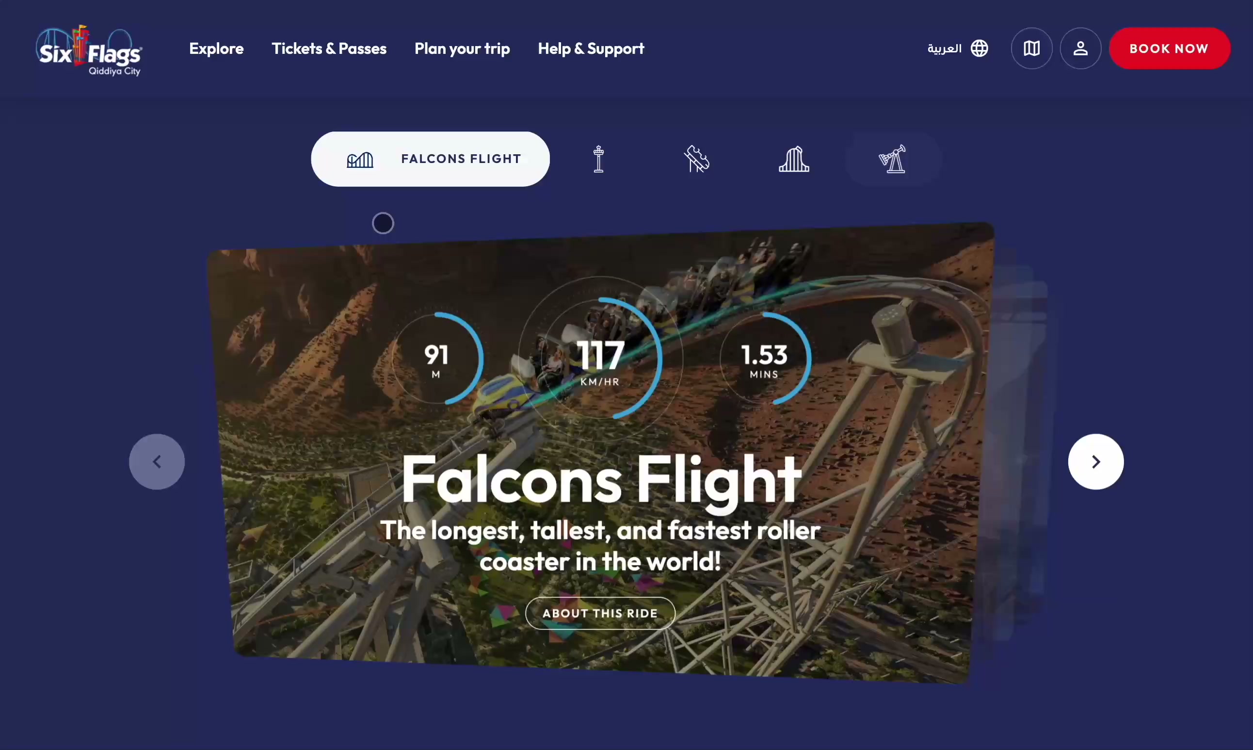
Component 01
Problem
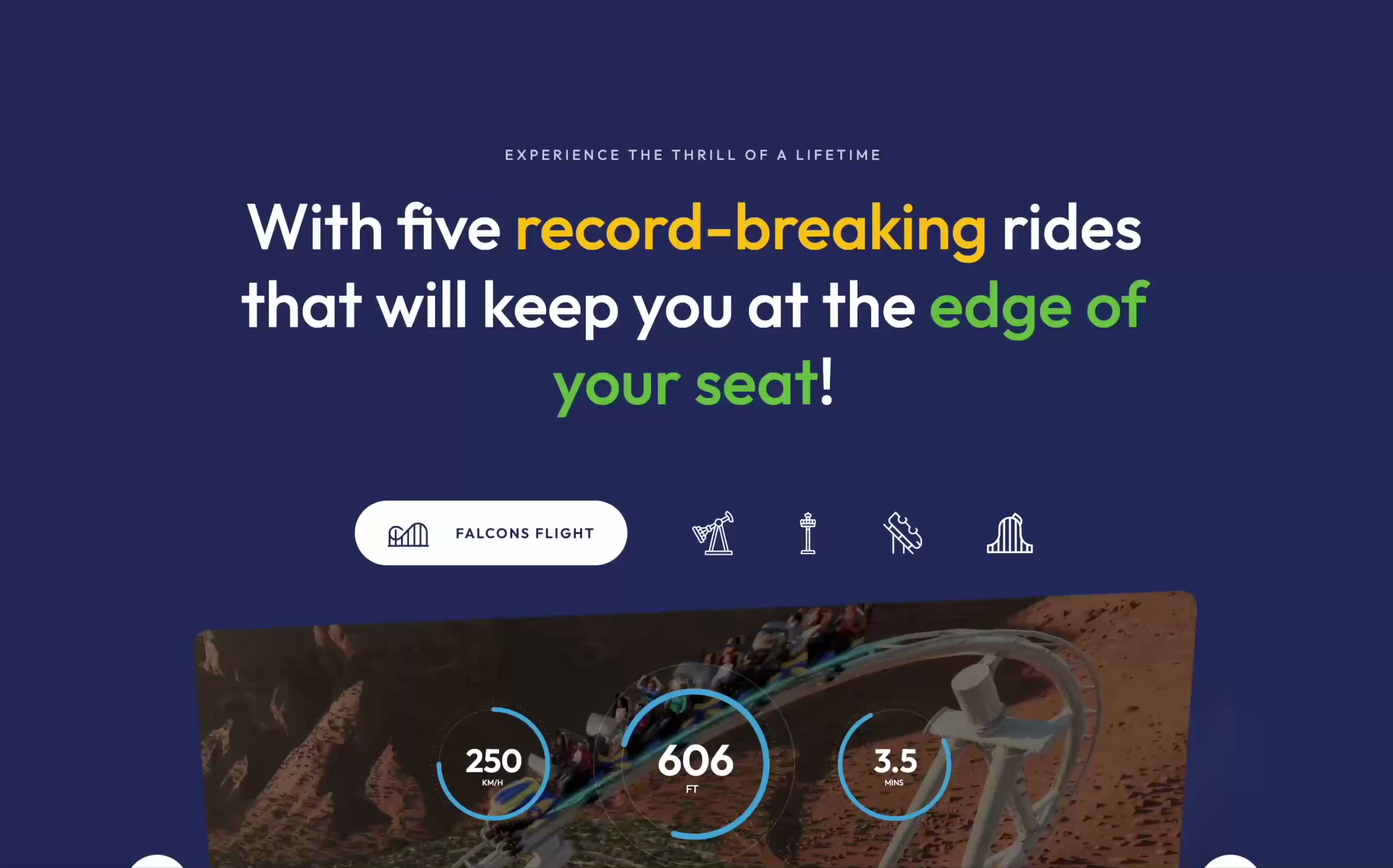
The record-breaking rides were the park's biggest differentiator, and people needed to grasp their scale without leaving the homepage.
Solution
A carousel of short cinematic previews, with stats that count up to their record figures, so each ride lands in seconds.
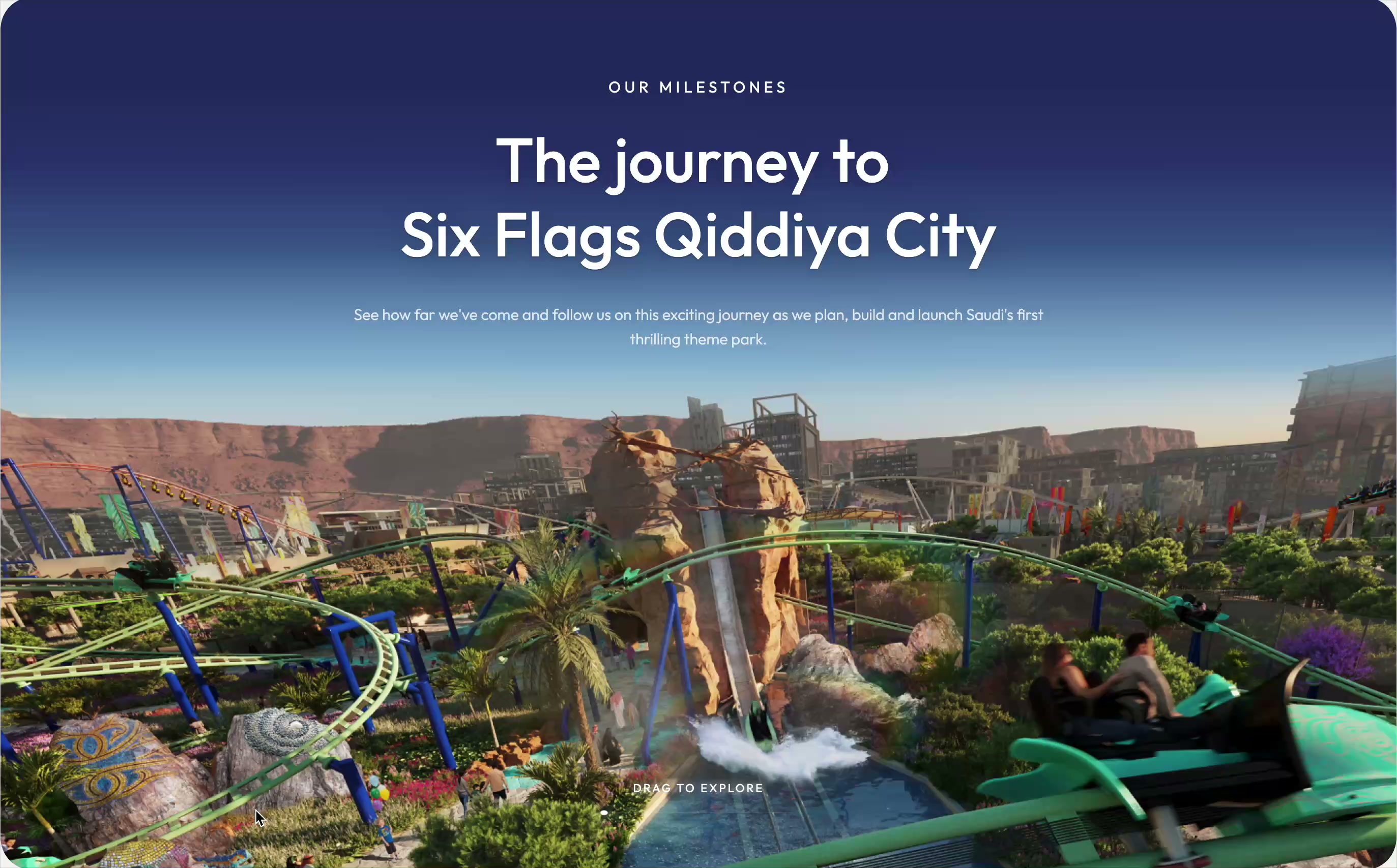
Component 02
Problem
With the park still under construction, visitors needed proof it was really happening. A list of updates wouldn't build excitement or trust.
Solution
An interactive timeline. Scrolling pauses as the background resolves into the first milestone, then visitors drag through the park's progress and open cards for detail.
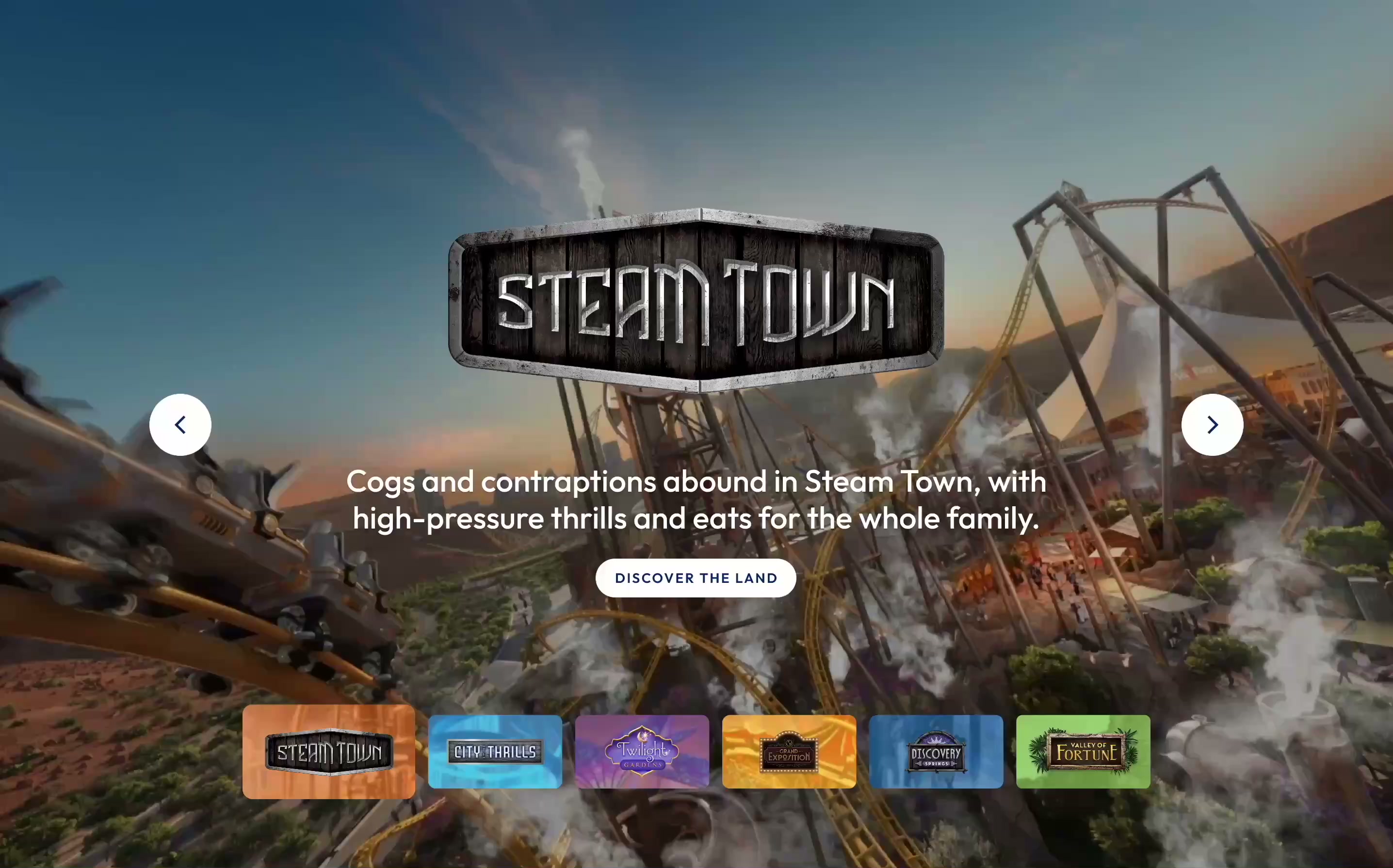
Component 03
Problem
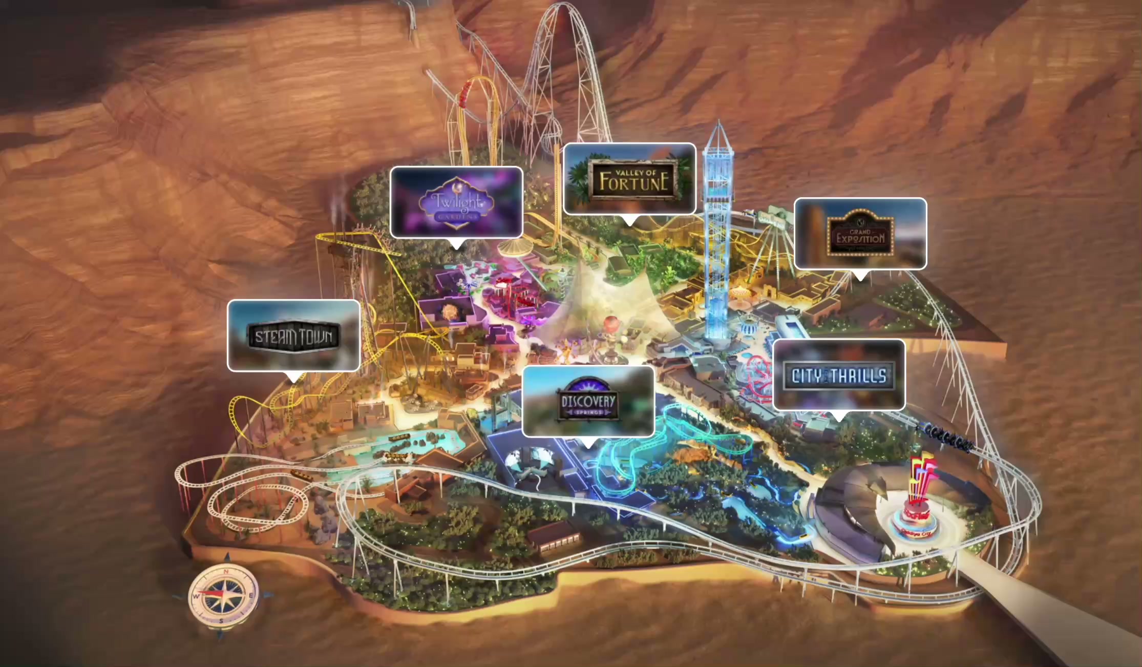
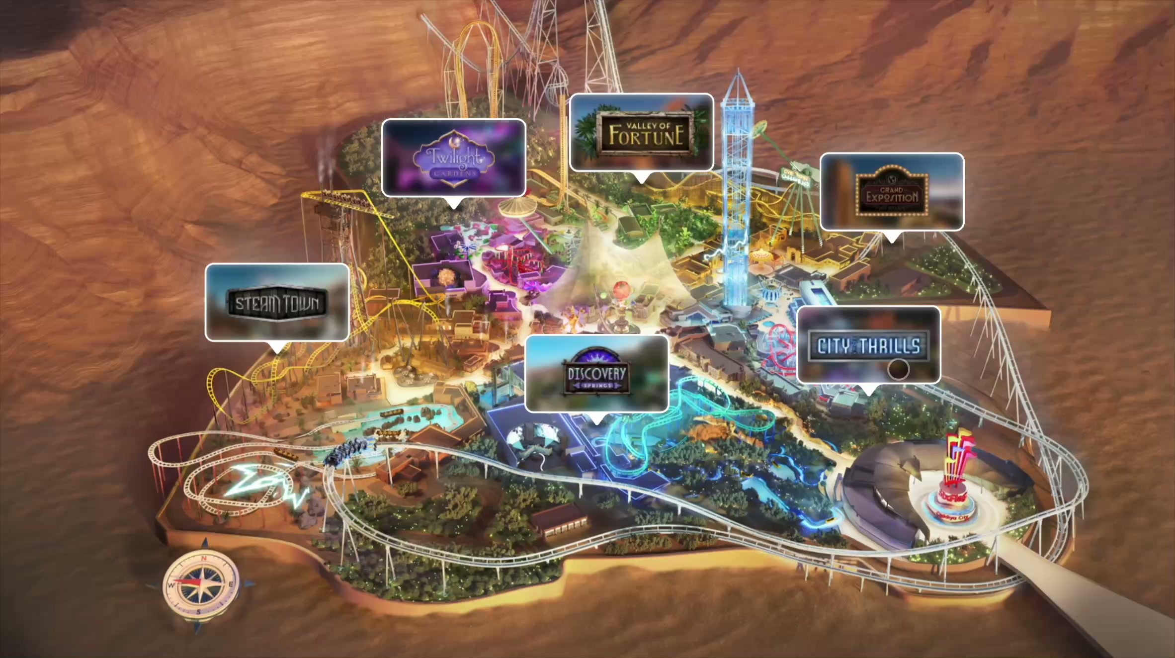
Six themed lands, each with its own identity. People needed a quick sense of the variety and scale.
Solution
A full-width preview for each land, switched from a carousel of land logos, with an overlay for more detail.
Designed for the Phase 1 awareness launch, then expanded across later phases and the mobile app.
Decision 01
We built on the Six Flags brand rather than inventing a new direction. The angled cut of the Six Flags flag became a recurring motif: "breaker cuts" between heroes and content, with rounded card corners echoing coaster track. The result reads unmistakably Six Flags, not as a generic entertainment site.
Decision 02
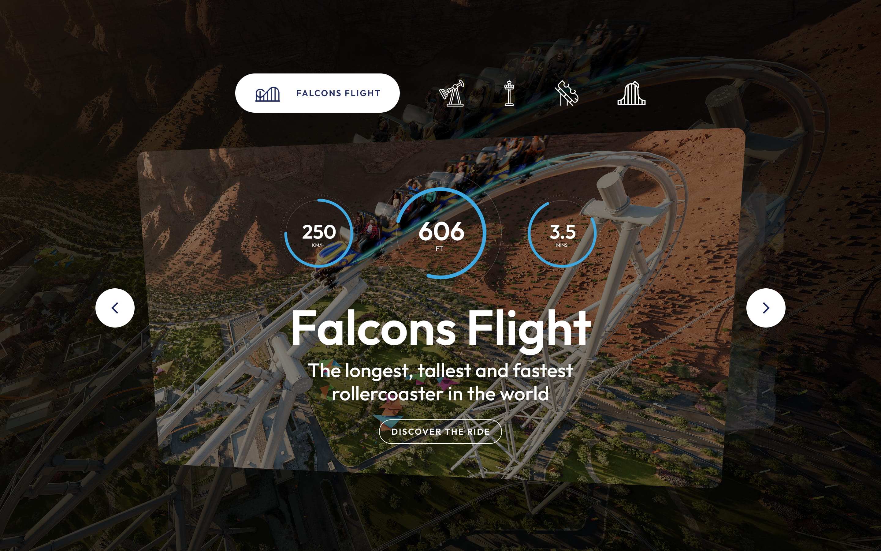
The record-breaking rides were the strongest hook, so we put them on the homepage instead of a subpage, even with limited supporting content. Excitement over completeness. Dedicated ride pages and filtering followed in later phases.
Decision 03
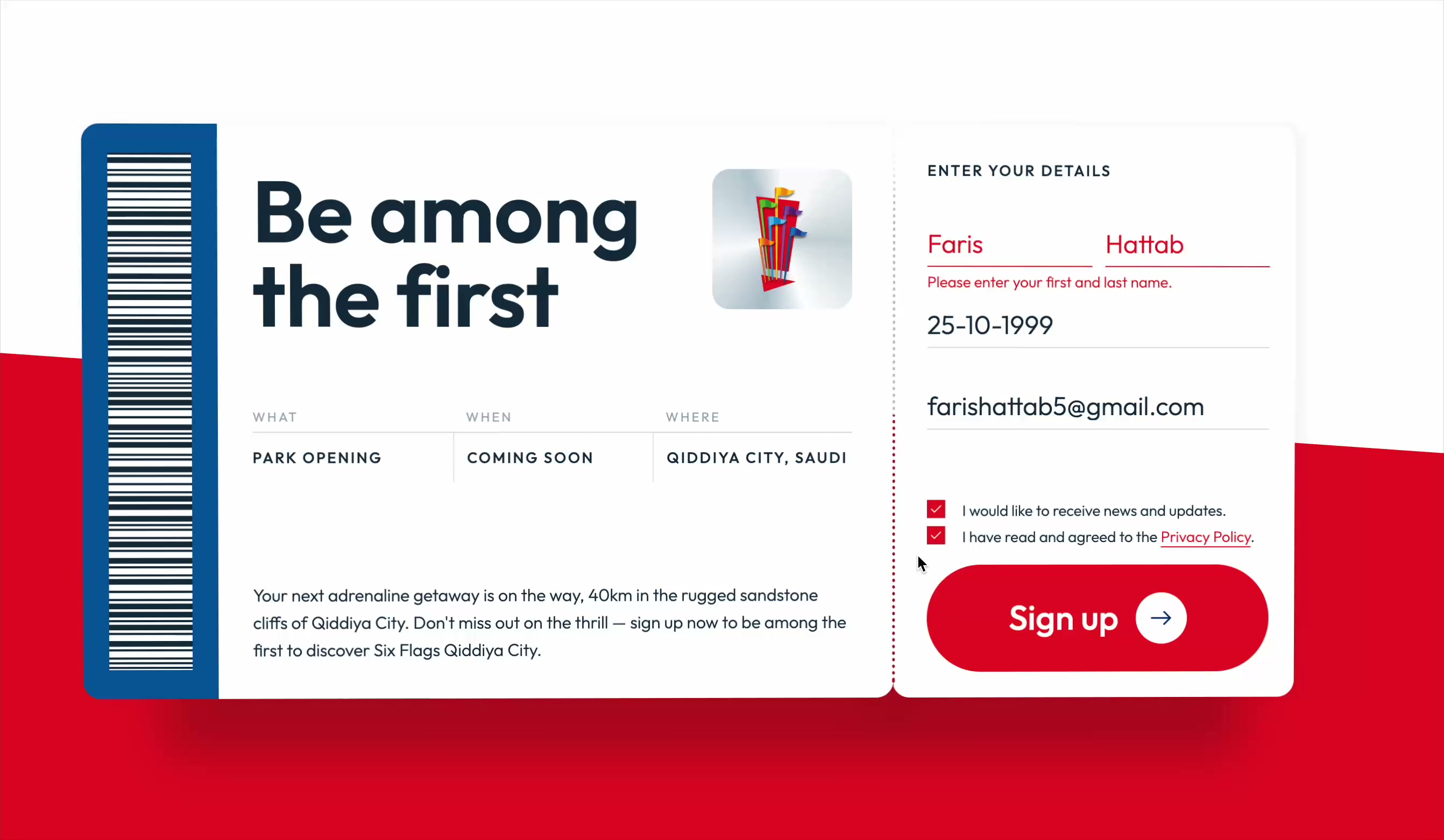
Pricing would have turned an awareness site into a comparison exercise. We left it out of Phase 1 and made sign-up the primary call to action, building an audience ahead of launch.
Decision 04
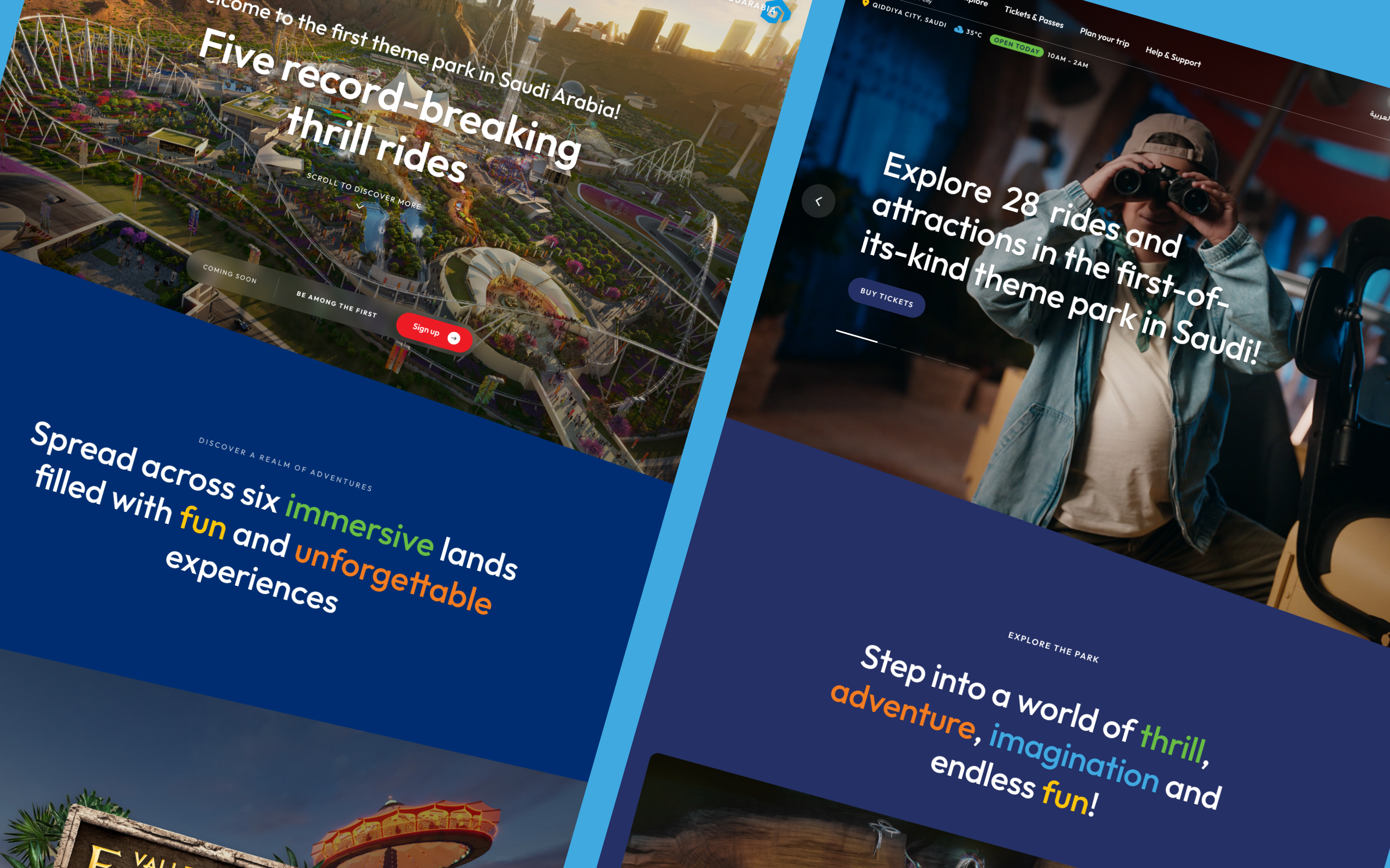
We treated the platform as a product, not a static site. Phase 1 was awareness; later phases added ride detail, dining, partner content and planning tools, all slotting into the same components and navigation.
01
Destinations without physical proof need emotional architecture first. The IA decisions that mattered most were about the sequence of belief, not navigation. Emotion before information, every time.
02
A design system pays off faster than you expect. On a large team with a short timeline, building the library before the pages felt slow in week two and saved three weeks in month five.
03
Stakeholder alignment is a design problem. The presentations that landed weren't the most polished; they gave stakeholders a clear yes or no on a specific decision, not a gallery to react to.
Next Case Study
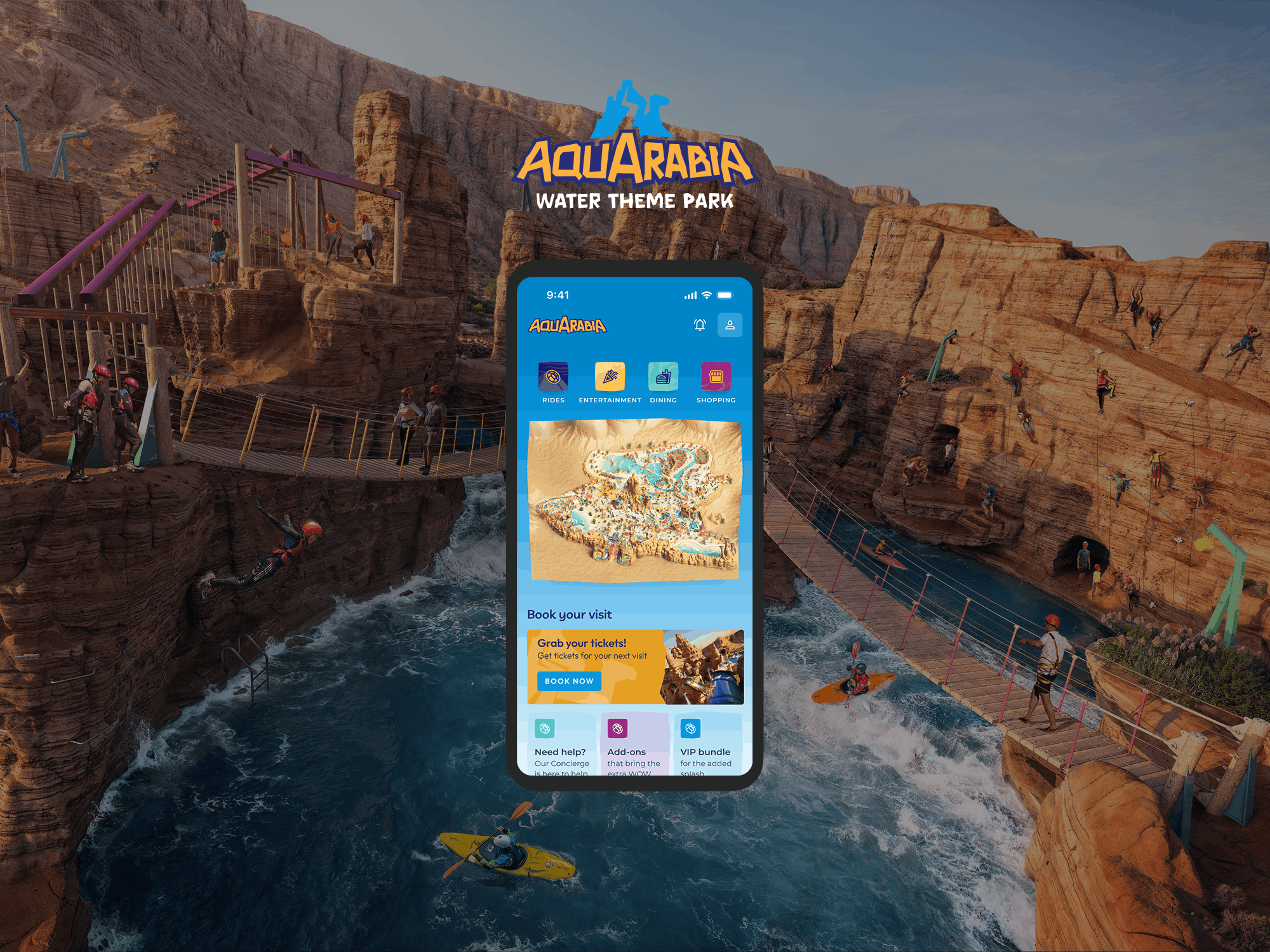
Aquarabia
The digital platform for Qiddiya's flagship water park, designed while the brand itself was still being defined.
View Case Study